Size-Intensity Plots
A New Way to Picture Economies and Other National Attributes
Barry A. Klinger
AOES Dept Home Page
Go to Examples
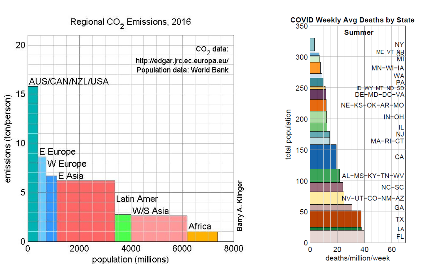
Often one wants to compare statistics for a collection of entities. The entities may be countries, geographical regions, demographic groups, or one of many other categories. When comparing a quantity that characterizes the entities, we often are interested in the intensity of the quantity and its total size.
Consider carbon dioxide emissions from different regions of the world. The United States and a handful of other countries have very high emissions per person. East Asia has much lower per capita emissions but has such a large population that the total size of the emissions is larger. Each of these ways of looking at the emission statistics is valid, and often we want to know both of them.
The size-intensity plot is a way to display both statistics at once by representing each member of the collection with a rectangle. In the figure shown for carbon dioxide, each rectangle represents a geographical region whose width represents population and height represents emissions per person. Since
total emissions = (per capita emissions) x (population),
the area of the rectangle gives the total size of emissions for that region.
The figure shown here represents a new way of presenting data (at least, one that the author has not seen before). It may be the best way of presenting comparisons of different groups based on two related variables whose product is also of interest.
A Plethora of Examples
There are remarkable number of applications of this size intensity technique. Some examples I've done include:
- Environment and Geography
- Carbon Dioxide Emissions: nations and continental regions
- Area & Population: US states
- Economics
- Politics
- Presidential Election: candidate margins of victories among states
- Regional Vote Patterns: FL, WI, NC 2016 presidential election
- Virginia 2017 Gubernatorial Election: candidate margins among counties
- Law Enforcement and Military
- Financial Support for Ukraine [New: Winter 2024]
- Military Spending: NATO Countries and Russia
- Border Arrests
- Police Killings: population and death rate
- Medical
- Covid Vaccination Rates and Age
- US Hospitalization Statistics for COVID-19
- COVID-19 Death Rates: comparison among states [external site]
If You Want to Apply This Technique
My email: bklinger@gmu.edu.
Figure may be reproduced as long as credit to me appears with figure and I am notified (please send me a brief email with your name and a sentence describing how you are using it).
I'd like to know if anyone uses this kind of graph with other quantities. Matlab program that generated the figure is available upon request. To the best of my knowledge the figures on this web page and others linked to here accurately reproduces the information used in creating them, but I take no responsibility for any damage resulting from errors in the graph.