What is each nation's share of the heat-trapping carbon dioxide injected annually into the atmosphere?
See below for Individual Nations and Emission Changes Over Time.
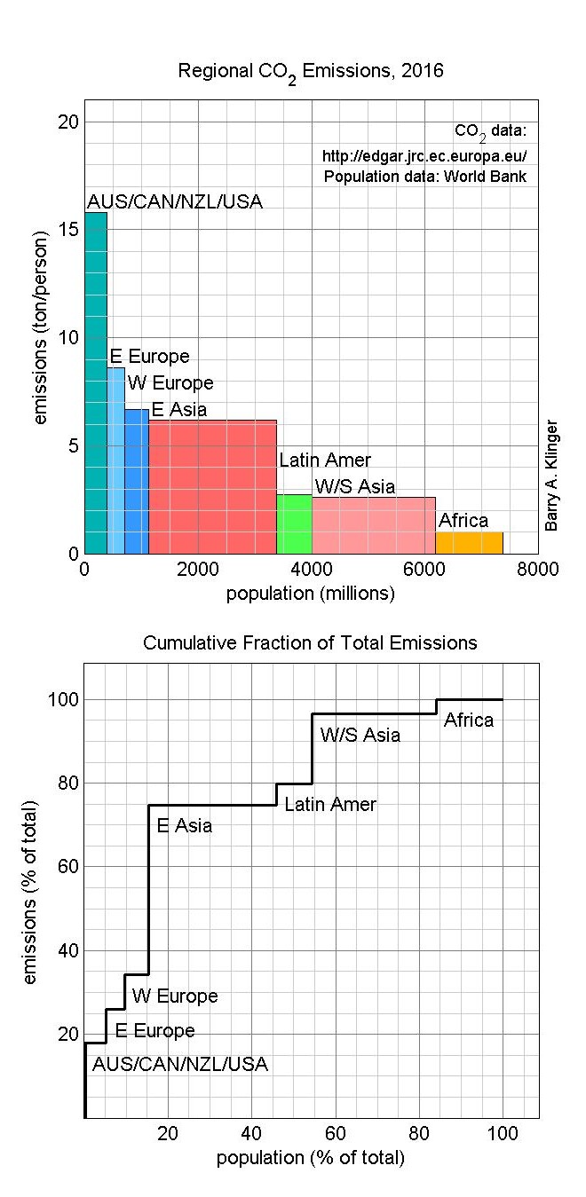
In this intensity/size plot, each geographical region is represented by a rectangle whose width is proportional to population, height is proportional to emission per capita, and hence its area is proportional to total emissions from the region. Thus we can simultaneously see how much is contributed by each person and by the entire region (see below for region definitions).
Per capita emissions. As the figure shows, the average person in the Anglo-Pacific countries (Australia, Canada, New Zealand, and United States) is responsible for far more CO2 emissions than in any other region. Europe and East Asia emit about half or less per capita, other Asians and Latin Americans emit half as much as East Asians, and Africans only about 6% of Anglo-Pacific inhabitants.
Total contributions (shown by area of rectangles) are affected by population, so East Asia, home to about 2 billion people, contributes as much as the 1st three regions combined (about a billion people).
Contribution of each region as fraction of the whole. In the second graph, each "step" represents a region, with the step's vertical distance representing percentage of global emissions and the step's horizontal distance representing percentage of global population. This shows us that the 5% of the world's population living in Anglo-Pacific nations contributes almost 20% of the emissions, the African 15% of the global population contributes only 5%, and East Asian contributions are near the global average, with 30% of the population accounting for 40% of emissions.
Who should act? In the US a common argument against taking action on CO2 is that US emissions are such a small fraction of the total that the effect of any action would be negligible. This is just as absurd as arguing that I don't have to limit my own pollution because it is a negligible fraction of the total pollution coming from my city. Individuals responsible for the largest amount of pollution have the greatest responsibility to curb it. In fact, the nearly 1/5 of global emissions due to the US and the other Anglo-Pacific nations is not neglible, either. However, while reductions should start with Americans and others with high per capita emissions, the large total contributions of East Asia and other population centers means that reductions can not end with American efforts.
Data is the most recent currently available. Geographic regions are:
Carbon vs. CO2: Emissions are often measured in tons of carbon or tons of carbon dioxide. Since one carbon atom has .27 the mass of a carbon dioxide molecule, carbon emissions will be a factor of .27 smaller than the same emissions measured as mass of CO2.
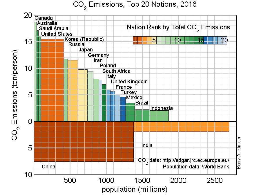
Regional statistics provide a good summary of emissions, but they can hide differences within regions among individual nations. The figure at right shows national statistics for the 20 largest CO2 emitters. Together, these nations account for 80% of global emissions. Among those 20, the nations are ordered by per capita emissions but colored to show the order in total emissions. To fit all the boxes better, China and India are placed below the other countries in the graph.
As the plot shows, the US has the highest per capita emissions of all the major carbon sources except for Canada, Australia, and Saudi Arabia, which together have only a third of the population of the US. East Asia has a wide range of emissions per capita, with 12 kton/person in South Korea, 7.5 in China, and less (not shown) in many other countries. Europe also has a wide range of per capita values, for instance 9.5 kton/person in Germany versus 5.6 in France. Among countries with less than 5 kton/person, India places second in total emissions due to its enormous population and Brazil and Indonesia make it into the top 15.
Wealthier countries tend to have higher emissions, but there are notable exceptions. Britain, Italy and France have less than half the per capita emissions of the US even though their per capita GDP is not so much lower. On the other hand, China has a much lower per capita GDP than the US, but still half the per capita emissions. Russians also produce a disproportionate amount of CO2 for their income level.
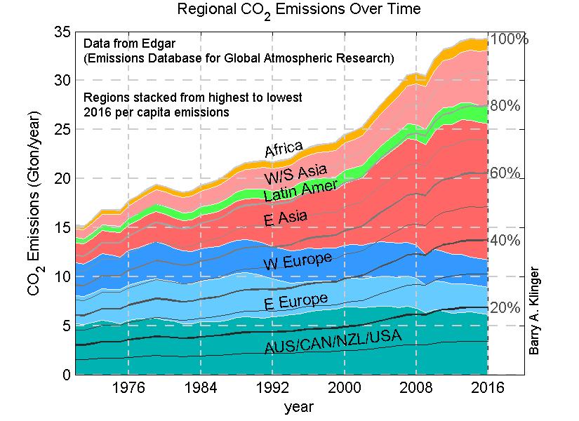
Current CO2 emissions are only one part of the story, because action to curb emissions must also take into account trends as well. As the figure shows, global emissions have increased in every decade, from about 16 Gtons CO2 in 1972 to 34 Gtons in 2016. Emissions have been stable (to a rough approximation) in Anglo-Pacific and European nations over several decades and growing in the rest of the world. Most of the increase in emissions has been due to East Asia.
The Anglo-Pacific and European nations had slightly increasing emissions in the early part of the record and decreases in recent years. East Asia had a large spurt in the early 2000's and shows sign of levelling off in the last few years. The other regions have continued to increase since 2008.
The gray curves in the figure mark various percentages of total emissions. Europe and the Anglo-Pacific countries contributed about 75% of emissions in 1972. Mostly because of growth in the rest of the world, their contribution was 55% as recently as 2000, and declined further to 35% in 2016.
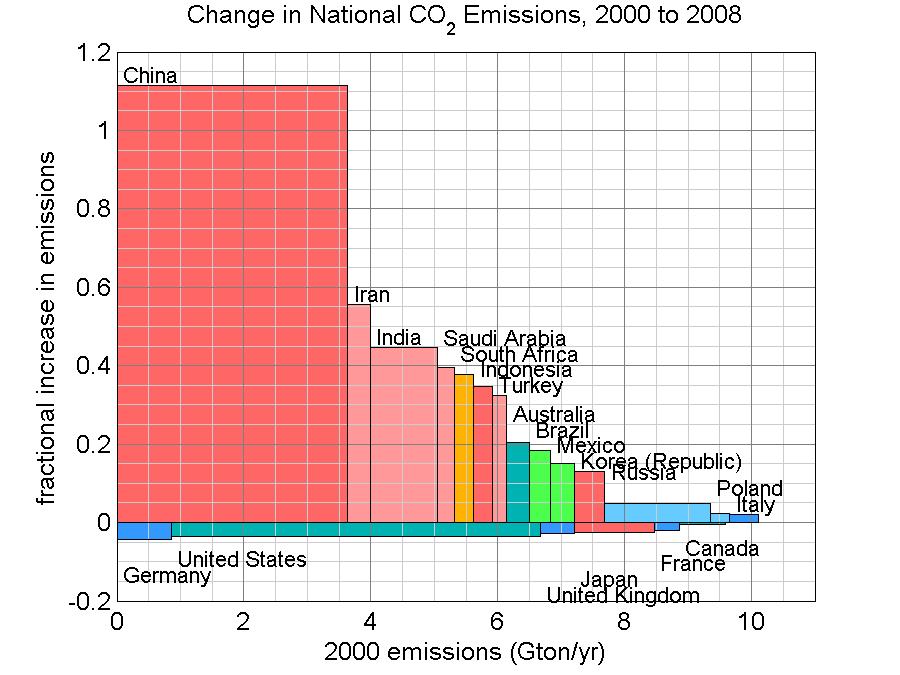
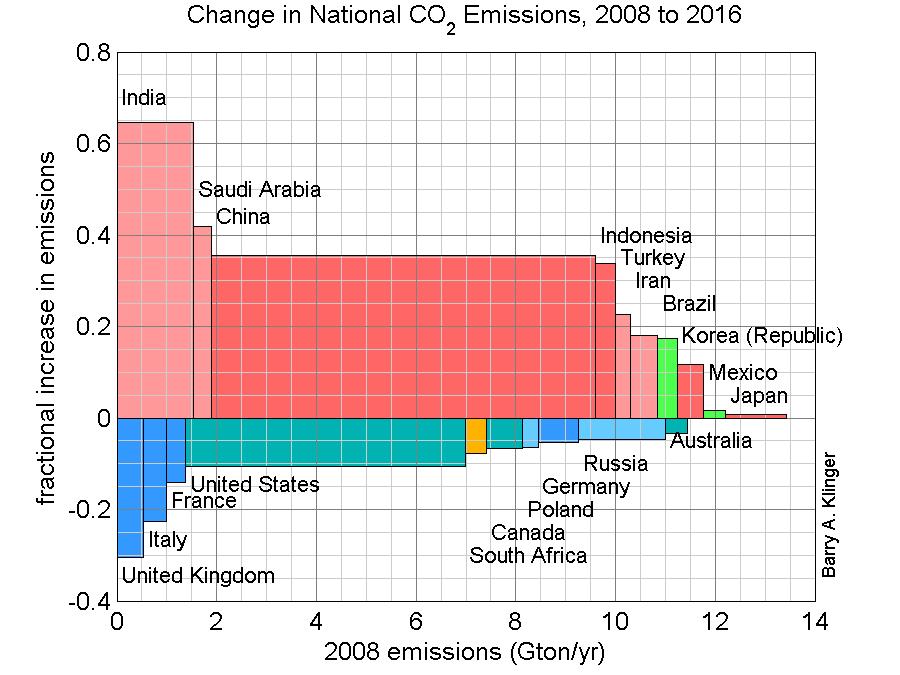
The figures below show changes in emissions for individual nations for two recent periods. Here, the width of each rectangle shows the total emissions for a nation at the beginning of the period, the height shows the fractional change over the period, and the area shows the total change in emissions.
For 2000 to 2008, none of the major carbon emitters made cuts greater than 5%, China more than doubled emissions, and some other countries (mostly in Asia) increased emissions by 30% or more. The 2008 to 2016 period shows some improvement. China's increase was 35%, still large but much less than the previous period. Several wealthy countries, including the United States, decreased emissions by at least 10%. Britain and Italy, despite starting with lower per capita emissions than the US, made cuts of about 25% or more.
The large increase in emissions from China and India, which even in recent years dwarf the modest decreases of some other countries, emphasizes the importance of reducing their fossil fuel use. While the US and other high-per-capita-emissions countries have the most acute need to make cuts, China and other rapidly-developing countries must also take serious action if the world is to succeed in curbing the rise in atmospheric carbon dioxide.
Post Script: More recent data released in late 2018 shows a return to CO2 increases in the US and continued increases elsewhere. US emissions spiked in 2018, in part from economic growth but also from the repudiation of emission reductions by the executive branch of the federal government.