Vaccination Rate by Age
By Barry
A. Klinger, June 2021
Return to
Size-Intensity Plots home page.
As United States health authorities race to increase vaccination rates in order to achieve herd immunity to Covid 19, attention has turned to the question of who is and who is not getting vaccinated. One factor that is often mentioned is age: younger adults, who have a smaller risk of severe consequences from the disease, tend to get vaccinated at lower rates than older events. How much of a difference is there?
The figure below shows the answer.
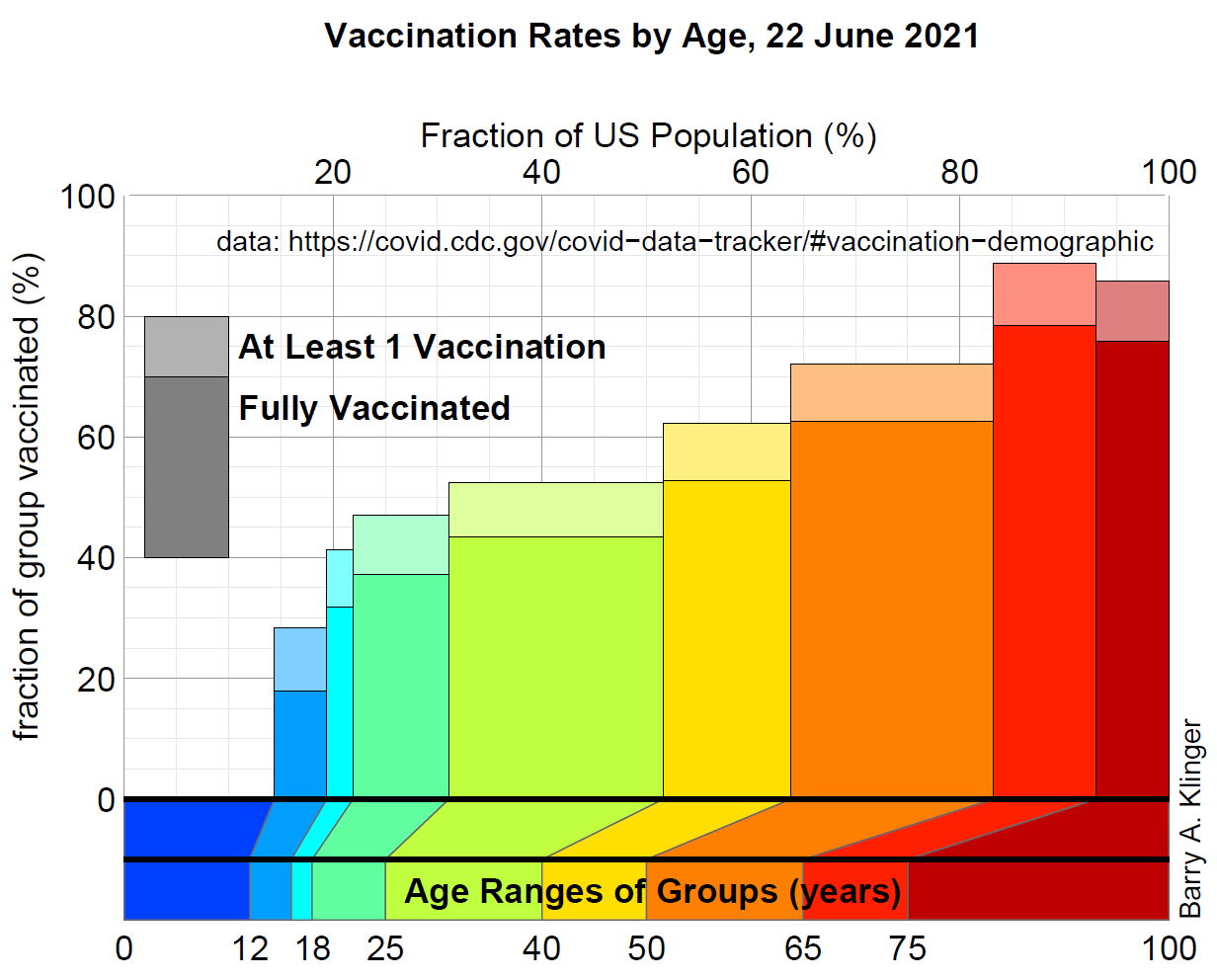
Description of the Chart
The figure shows a lot of information at once. The main part of the chart has rectangles representing each age group. The width of the rectangle tells the percentage of population in that group, and the height tells the percentage of the group that has been vaccinated. There are actually two rectangles for each group: a darker one representing the percentage of people that are fully vaccinated, and "behind" it, a lighter rectangle poking up from the top showing the percentage with at least the first vaccination.
To take an example, the orange rectangles represent ages 50-65. The rectangle's width shows that that age group has about 20% of the total population, and the heights show about 60% of the age group fully vaccinated and a little over 70% at least partly vaccinated.
Each rectangle has an extension at its bottom reaching out to the "Age Ranges of Groups" chart. Here, width of each recangle represents the number of ages included in the group.
One note about the data: CDC statistics only include age for 92% of the people vaccinated. If we only include that 92%, we would underestimate the actual number of vaccinated people. Since I don't have any more information about how much people in each group disclosed their age, I will simply assume that its 92% for each group, so I divide each number of .92.
What the Chart Says
Average vaccination rate for everyone over 18 is about 66% (at least one shot) and 56% (fully vaccinated). Clearly a large number of people haven't been able to access them, are not sure they want them, or actively refuse to get vaccinated.
What do we learn from the chart? For starters, it is clear that the conventional wisdom about age is correct. For almost the entire age range, older groups have higher vaccinations than younger ones. Also, for much of the age range, the increase of vaccination is pretty steady with age. The rate turns out to be about 1.25% greater for each additional year of age. Though vaccination rate increases with age, between ages of about 20 and 70 it does not increase abruptly.
This tells us that, even though younger adults have a lower vaccination rate, the low national rates are not purely due to this age group. Many people between 50 and 65 years old have died of Covid, but even in this group, almost 40% are not yet fully vaccinated and almost 30% don't have any vaccination. Only the over 65 demographics have rates of full vaccination approaching 80%.
These results suggest that it might be dangerous to only focus efforts on the relatively small group of people under 25 years old, even though they have the lowest vaccination rates. About a third of the population is in the 40-65 age range, groups that are fairly vulnerable to Covid and yet have large fractions of unvaccinated. Just as senior citizens were given higher priority at the beginning of the vaccination program in many states, the same logic may point to focussing on adults in their 40s, 50s, and 60s.