Aesthetics
Aesthetics is a key element of good design, but the crux of this attribute is that it can be very subjective to your audience. Again, everything leads back to knowing your audience, and thinking about the impact the look and feel of your website will have on them.
I strongly recommend that you visit csszengarden.com to help get an idea of the impact that design can have on the look and feel of your website.
When you step back from website aesthetics, it may appear to be one topic, but when you look at the topic a bit closer, you'll see that it's really many topics that fall under a common umbrella. Let's examine a few topics that I recommend you examine more closely.
Fonts
As a general rule, I don't use Comic Sans. Ever. But that doesn't mean that you can't. Again, find something that won't offend you audience, but you'll also have to find something that suits the overall theme of your website. Some fonts have an inherent feel. Don't use something too traditional looking if your theme is modern, and vice versa. I have a lot to learn in this area, but if want to get some information from a more knowledgeable source, check out this article.
Color Palette
I like CSSZengarden so much, I think you should just browse around until you find a color pallet you like, then steal it. But, if you're determined to go out and find a unique color scheme, there are lots of tools online you can use to generate a palette. In fact, this site does nothing but list online tools you can use to generate a color scheme using color theory, rather than just trying out colors you like and seeing if they complement each other. I still stand by swiping someone else's colors.
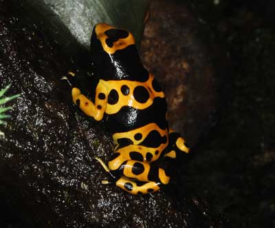
See that frog up there? Its bright colors are a warning to stay away. Take a lesson from the frog - too many bright colors and people will stay away from your site.
Images
Web images can fulfill a couple uses. In some cases website images are content. Pictures of bicycles in a gallery on a website about bicycles are content. A picture of a man along side a story about that man is also content. But a picture of acorns repeated in the background isn't really content; it's an image used to enhance the design.
In any case, you'll want to think about whether you need images, what kinds of images your website visitor will want to see (and what kind they won't want to see), and what images are safe to use. By safe, I mean legal, and to some extent, ethical. Copyright infringement is dangerous territory, so make sure you give thought to whether the image you decide to use isn't protected by a license. If it is protected, be sure to comply with the terms of use - I'm a big fan of Public Domain images, for that reason. Read more about Public Domain.
Space
If you've ever seen the Google landing page, you might have noticed that it makes use of lot of white space. Some people call that a minimalist approach. Some people like it, others prefer to make use of all the space available to them (although that doesn't necessarily mean you have to cram every inch of screen with content).
Each approach can have have benefits. You should try both ends of the extreme, or if you want to do some research before you get that far, read up on use of white space here. It's harder to get right than you might think.