Why 1st, How 2nd
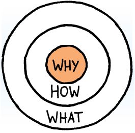
The "how" part is the part most people focus on when designing a product or website. How am I going to display this information? How am I going to make my product function? These are incredibly vital questions to the design process, but focusing on them can lead to a cluttered or over complicated design. The image blow is called the gold circle and is often used to show why design:

The idea seems simple, almost self explanatory but is easily forgotten and hard to grasp. The reason for this is are people are feature focused. They want to be able to do things. Especially in a world where new technology allows for a sort of arms race when it comes to design. This is how silly rules of design get engraved in the heads of creative minds. A person naturally wants to do what others who are successful are doing but do it better. For instance it is almost impossible to find a site that doesn't have multiple links to various social media accounts on it’s homepage. This is helpful in some respects because it gives designers some things to remember or focus on. But sticking to these norms can distract from the reason for the site, especially when designers try to exceed norms. They then overload there site with features and fancy CSS or lots of confusing navigation bars. You need to also think of why first and then how second.
Returning to our art student. She has now decided that impressing her employers and getting a job is her why and is designing a webpage. So how is she going to impress her future employers? She knows what the best way to show off her work is, to have her site be a gallery of all her work that the employer can browse through. That is a good idea, that everyone has had (see dievantart), which makes it rather unimpressive. She could also have it open on a picture of her with a bio and links to her social media. Yet, that is common too. Instead she opts too put full screen images of her most popular pieces with a transparent navigation bar with links leading to her bio and or her gallery. She knows that bio and the gallery are important features to have on the site so makes sure to include them in a way that doesn't detract from her why.
