Complement, Contrast, Vibrancy
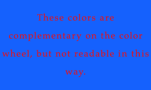
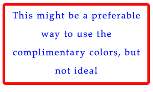
Complementation is the way we see colors in relationship with other colors. Opposite spectrums tend to be more visually appealing.


Contrast helps direct a user's eye to specific elements on a page. Many suggest to use a very light color for the background and a dark color for the text for contrast and readability.

Vibrancy dictates the emotion of a design.
Brighter colors lead to a different emotion than darker, or muted colors.
Resources: