Fun Fact: If you want to line up the days with weeks, note that day #1 (June 1) was a Monday, [Spring Week 12].
If you just want the latest update, see below. To see original post, go to 2018 Temperatures.
Note that this page compares weather to the last 30 years, which is already affected by human-caused climate change. To see long-term signs of warming in Northern Virginia, see Hot Days and Hotter Nights in DC and Shifting NoVa Temperatures
June-July in Northern Virginia has been marked by heatwave after heatwave, with DC "poised to break" the record for most July days in the 90s according to the Capital Weather Gang at the Washington Post.
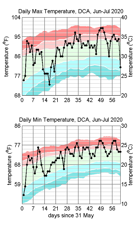
We can see recent temperatures in a climate context by comparing them to percentiles of days (figure at right). The colors are based on statistics from the last 30 years of National Airport (DCA) temperatures. Dark colors represent the range of temperatures in the bottom (blue) and top (pink) 10% of temperatures for that day of the year over the 30 year record. Lighter colors represent 10-25% range. The plots show this for both daily maximum temperature (top panel) and daily minimum (bottom panel).
The more dramatic sign of the heat wave is not the 90+ degree high temperatures but the warmth of the daily low temperatures. Typical daily lows in July are around 69-75oF. This year, we've been dividing our time between daily minima in that range and in the high 70s. For the whole 2 month period, nearly half the days were in the top 25%, and only 3 days were in the bottom 25%. You know that feeling in the summer when you can go out at night to cool off? It hasn't come since early June this year.
Global heating from greenhouse gases is also stronger at night than during the day, but is not big enough to account for the difference between the 1990-2019 statistics and this year. As we move forward in time however, days that never cool off will probably become more common.
Fun Fact: If you want to line up the days with weeks, note that day #1 (June 1) was a Monday, [Spring Week 12].
Confused about percentiles? Suppose you want to know the typical temperature range for July 7. You can collect the July 7 temperatures for each of the 30 years in your records, and list them from lowest temperature to highest. The 50th percentile (written 50%) represents the temperature of the day halfway down your list. Similarly, the 90% is the temperature of item 27 (90% of 30) in your list. If you did this calculation for 300 years, your graph of the temperature of (for instance) the 90th percentile would change smoothly from day to day, but for a 30 year period the graph has a lot of bumps because of weather. To estimate what it would look like if we had more data, we take a 13 day running mean, so the temperature shown in the graph for the 90th percentile on July 7 is actually the average of the values from July 1-13.
Source of climatological data is listed under Data Sources below. This year's temperatures are from the National Weather Service's Baltimore/Washington Forecast Office.
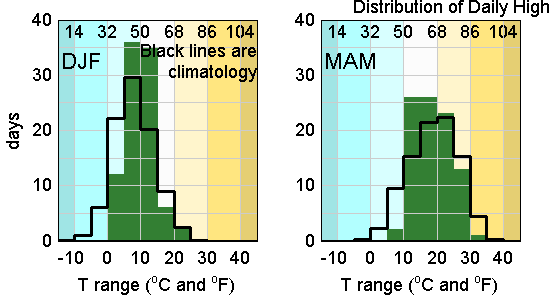
This spring was a good lesson for me in the unreliability of personal weather impressions. I've been saying that this has been the most beautiful spring I've seen in years (other than the deadly pandemic, police misconduct, protests and riots). Unlike metro DC's usual hot and muggy weather, which always comes too early for me, its been cool and pleasant.
Well, it has been beautiful, but not primarily for lack of hot days. As the March-April-May temperature distribution below shows, this year had about 4 fewer days than climatology above 86 F and 2 fewer in the 77-86 range. Really the story was in the lack of cold days, with no days colder than 40 F and only 2 in the 40s, a total of about 10 fewer than climatology. Instead of the hot and cold days, it was another season of "centralizing" temperatures (see Winter 2020 Update below), meaning fewer at the extremes of the distribution and more near the center. MAM had about 11 days more than climatology in the 50s and 5 more in the 60s.
In a sense, this spring was more a case of winter leaving early than summer arriving late.
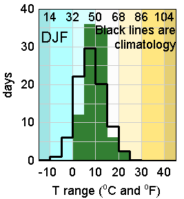
22 December 2019: Fall 2019 once again has somewhat fewer days with moderate temperatures, more days with warmer temperatures. Number of rainy days a little below climatology, with some more days of strong rain in October. Most of the rain for the season fell in October.
5 October 2019: Winter 2019 temperature distribution was close to average, with somewhat fewer days in the 40s and more in the 50s and 30s. There were more warm days in Spring (fewer in the 60s and lower, more in the 70s and higher), and more hot days in Summer (fewer in the 80s, more in the 90s).

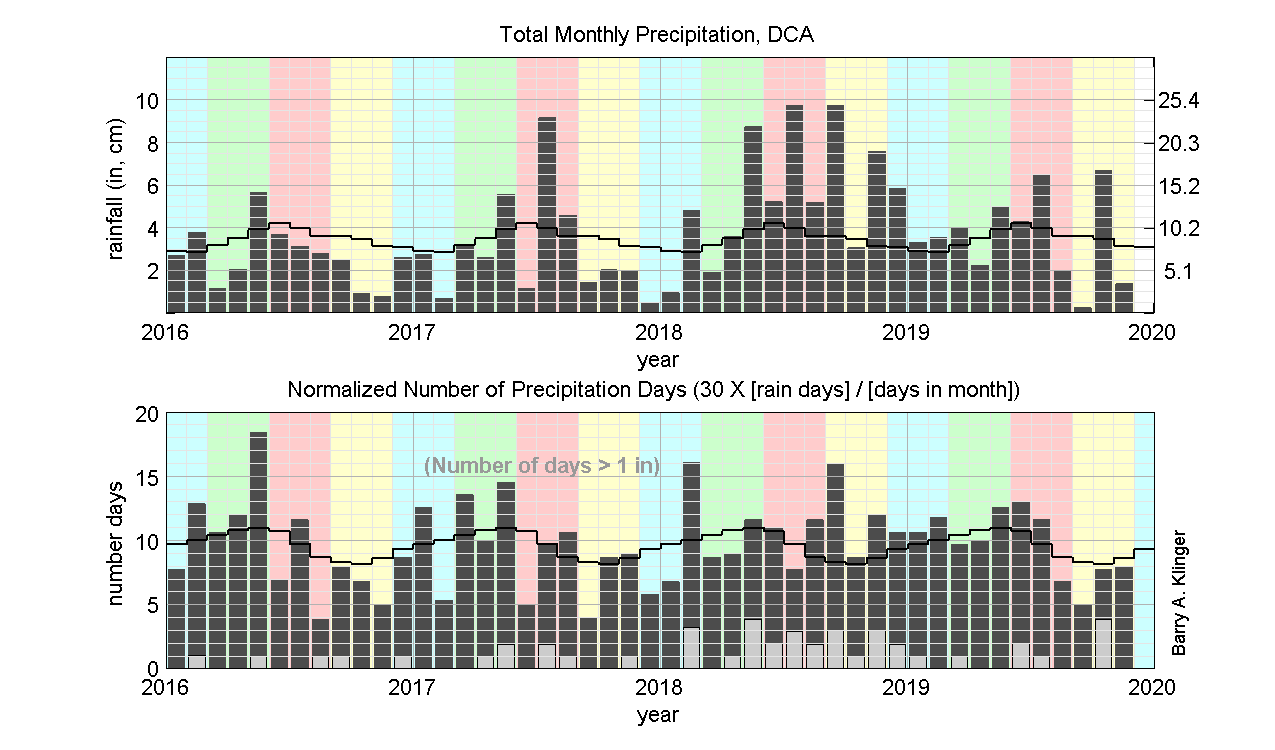
After a rainy 2018, 2019 has seen precipitation much closer to average.
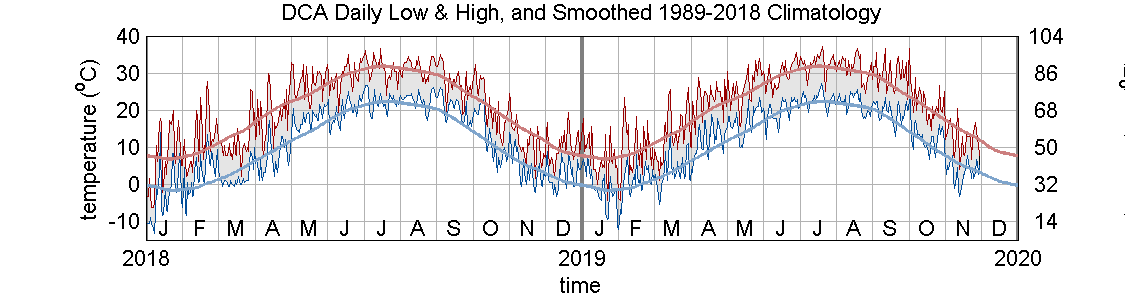
February 2019: My memory of recent weather in the Washington, DC, metro area, is that 2018 had no spring, no fall, and way too much rain. Is that what the data shows? To find out, I looked at daily data from Reagan National Airport (airport code DCA), in Arlington, VA, just across the Potomac River from DC.

The plot of daily minima and maxima shows how temperature varied over time, but the level of detail makes it hard to draw any conclusions except to note the unusually cold and warm days in Jan-Feb 2018 and the long run of unusually warm days in winter-spring 2017.
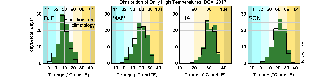
Another way to look at temperatures is to count how many days there were with the daily high in various temperature bins. The figure below shows the temperature distribution for each season of a given year (green bars) and allows comparison to the average distribution based on the entire 1989-2018 record (black "stairsteps").

The temperature distributions show clear departures from climatology for spring (MAM - March, April and May) and autumn (SON). Climatologically, the most common temperatures for daily highs in spring and fall are the 60s and 70s Fahrenheit. These are the canonical "beautiful spring [or fall] days" of the year. Unfortunately, in 2018 both seasons had fewer of those days, compensated in part by more days in the not-so-beautiful 40s and 80s. On the other hand, the "beautiful day deficit" was not as big as it seemed to me, with at least 25 days in each season hitting highs in the optimal range (15-25oC, or 59-77oF).
Winter (DJF, 2017-2018) also had fewer "average" and more "extreme" days, including the day with a high of nearly 86oF (30oC). Summer (JJA) was the one season to go the other way - more days that were slightly warmer than average, but fewer very hot or very cool.
Note that the climatological temperature range of summer is smaller than the other seasons, and so the temperature bins are narrower as well.
Back to TopFor precipitation, it is interesting to track total amount of rain and how often it rained. The bar charts below show this, with total amount each month (top panel) and number of days with rain (bottom panel). The "stair" plot shows climatological values for the 30 year record.

The Washington area does not have a strong seasonal cycle in precipitation, with the minimum (in January and February) only about 25% smaller than the maximum in June. Over the nine years shown here, most months (about 2/3) had below-average rainfall, balanced by a few months with rainfall much higher than climatology. Average number of rainy days per month also has a relatively weak cycle, with the peaks occuring a few months earlier than corresponding rainfall total.
2018 as a whole was quite rainy, with rainfall totals above average in nearly every month and with four months since May having nearly double or more the climatological amount. The number of rainy days was not as different from other years. However, besides having fewer days with moderate temperatures, autumn (SON) also had more rainy days than usual.
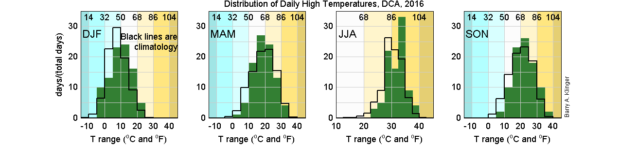
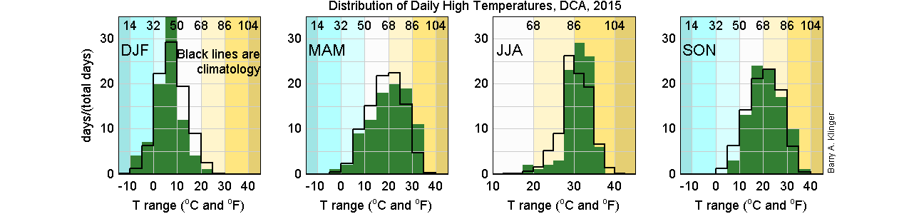
Back to TopFor comparison, here are the distributions of daily high temperatures for each year from 2015 to 2018.
Daily data from NOAA weather stations is available at https://www.ncdc.noaa.gov/cdo-web/datatools/records.
Last modified: 28 July 2020