Shifting NoVa Temperatures
Barry A. Klinger, Winter 2015
Return to Local Weather and Climate
Changing Temperature Distribution
Is it warmer than it used to be? The last couple of winters has people asking about the cold instead. Here is another way to think about if and how the weather is changing in the DC area.
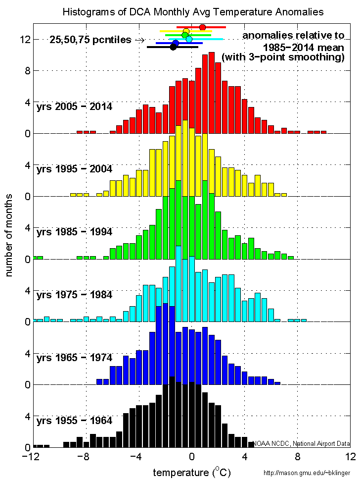
The plot at right shows a frequency distribution of different temperature ranges shown at the bottom of the figure. The data is broken into 10 year intervals. Each bar represents how many of the 120 months of a given decade had a temperature within .25o C of the temperature under the center of the bar (see bottom of graph). The temperatures shown here are differences from the climatological (1985-2014) average for each month of the year. Each distribution is offset by a different amount in the vertical in order to make all of them easier to see.
The distributions move from right to left as we go back in time, indicating that there were more cold months and fewer warm months in (for instance) 1955-1964 than in 2005-2014. All the distributions overlap, meaning that all decades had temperatures that were close to the 1985-2014 average, but the most common anomaly in 2005-2014 was about 3o C warmer than the most common anomaly in 1955-1964.
The median temperature anomaly of each decade is shown by the horizontal position of a dot at the top of the figure (color coded by distribution and displaced a bit in the vertical from each other for clarity). The horizontal bar through each dot shows the range from the 25th percentile to the 75th percentile for that decade. These show that the median temperature anomaly for 2005-2014 is warmer than 75% of the anomalies in 1955-1964.
To summarize, the distributions show that, although there are always unusually warm and unusually cold months, an "unusually cold" month in the 2000s would have beeen considered close to average in the early 1960s.
Technical notes: data came from the same source as Monthly Temperature History. To improve clarity, the frequency distribution numbers were smoothed with a three-point running mean. The unsmoothed data shows a similar shift with time.
Last modified: 5 October 2019