Visual Heirarchy and Gestalt Theory
So we are going to start with Gestalt theory because that is the foundation of creating a visual hierarchy. Gestalt is German for form, shape, or pattern. And the basis of the theory is the proposition that perception is always organized and is based on patterns. When we look at something we see a whole image rather than collections of parts. The lizards in this Escher tessellation form a pattern, and it’s on closer examination that we notice the components of the pattern. Gestalt theory is generally based around 8 laws of grouping. These are them. Since the gestalt is typically a cognitive process (because it is about one’s perception) it’s difficult to observe it, but if you understand gestalt theory then you can use it as a guide during the design process.
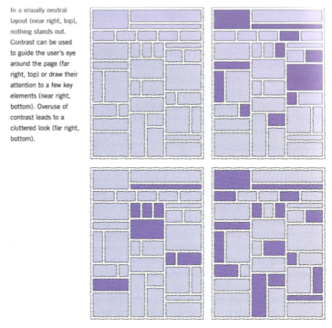
Gestalt Theory on WikipediaThe “rules" for creating a visual hierarchy are inspired by the laws of gestalt theory. For example proximity and symmetry can be components of alignment. The gestalt laws of grouping provide guidelines for the organization of information into groups. However, a strong visual hierarchy guides the user to what is important, thus creating a hierarchy of information as the name implies. Which means it’s not just about when to employ gestalt theory but also when to ignore it, sometimes disorder can be good because it adds contrast and can delineate important information. If everything is in an organized coherent group then nothing stands out. (Consider the tessellation with the lizards, depending on the color of the background, one set of lizards draws your eye over the others). So in practice it’s important to balance the two. You want an organized and visually appealing design but you also want to funnel information to the reader in a certain way and sometimes that can get a little ugly. So follow the gestalt laws to group and organize information and then create hierarchy by delineating the important stuff. Check out the wikipedia on gestalt theory and familiarize yourself with the rules to gain a good understanding of what it's all about!
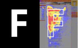
Usability expert Jakob Nielsen’s study of web usability showed that users “read” online media in an F shaped pattern. Professor Mark Bauerlein (emory university) felt that this style of web reading is a lesser kind of reading. But it’s an obstacle that has to be dealt with, and maintaining a strong visual hierarchy in your websites is a good way to try and counter or subvert the potential laziness or complacency in a user’s reading habits.
Sources and References:
Bauerlein, M. (2008). Online literacy is a lesser kind. The Chronicle of Higher Education, 55(4), B10-B11. Retrieved from http://search.proquest.com/docview/214657322?accountid=14541
Garrett, Jesse James. (2011) The Elements of User Experience. Berkeley, CA. New Riders.
Jackson, Ian. “Gestalt—A Learning Theory for Graphic Design Education.” International Journal of Art and Design Education. Volume 27. Issue 1 (2008): 63-69. Digital.
Jones, Brandon. (2011) Understanding Visual Hierarchy in Web Design. http://webdesign.tutsplus.com/articles/understanding-visual-hierarchy-in-web-design--webdesign-84
Pettersson, Rune. “Information Design—Principles and Guidelines.” Journal of Visual Literacy. Volume 29. Issue 2 (2010): 167-182. Digital.
