Typefaces & Fonts

Typefaces
A typeface refers to the actual letter or symbol used to represent language.
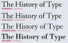
Serif & San-serif are the two main categories of typefaces. Though there are others, these are the most commonly used typefaces in document texts.
Serif fonts have feet or decoration, are typically considered formal or traditional, and they are generally used with bulk printed texts for readability.
San-serif fonts do not have feet or decoration, are typically considered all-purpose, and they are easier online and in larger sizes.

Script and Display fonts are two more categories of typefaces. Script is representative of handwriting, and Display can be sort of a creation. These two categories are less frequently used than serif and san-serif, but they can be found in logos, headers, titles, and other design items used sparingly in a product.
Fonts
Font refers the name of a specific set of text of a typeface. One important thing to remember is that not every font is free. Fonts, like images, are artistic creations and covered under copyright laws.
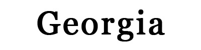
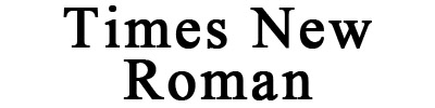
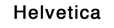
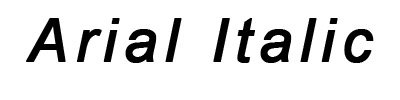
Some common fonts are:

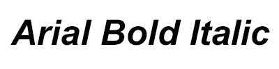
Font-family refers to the style of the font: Bold, Italic, Narrow, Bold Italic...
Fonts with big font families can be useful because they provide more options for use throughout the document, but they remain somewhat consistent.


Fonts can be altered in terms of size, spacing, and line length, but it is important to make sure these stylistic attributes aren't overdone. Watch out for common mistakes!
Leading refers to the space between lines of type, from baseline to baseline. It's important to adjust leading with font size, or the lines of text will look squished together.


Kerning refers to the space between two characters. There is a difference between "tracking" and "kerning". Kerning refers to the space between specific letters, and tracking refers to space between the characters of a word.
Tip: The bigger the word, the better the kerning & tracking have to be to avoid illegible text.

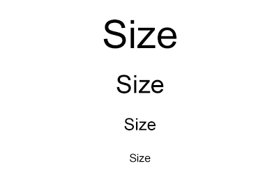
Size refers to the height and width of each character. Size is most often used to indicate hierarchy. Larger sizes are used to show titles or headings and smaller sizes are used for bodies of text.