Introduction
This website is a follow-on to the "Finding the Kam Zero:" site that I developed for my type assignment in HI697. The link to that site is on the navigation bar above. This site concerns itself with images and colors of the Kam Zero, and of the US Army Coast Artillery fort where the Zero came to rest on December 7th, 1941.
The Original Question
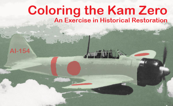
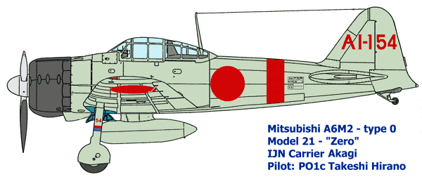 The Kam Zero, number AI-154, was one ship of the First Wave of attacking aircraft during the Pearl Harbor raid. AI-154 took off from the Japanese aircraft carrier AKAGI, and like other aircraft from that ship sported a red band around the fuselage aft of the national marking. The Kam Zero, like other naval Zeros, was originally painted a light grey-green, as shown in the profile to the left (from the Wings Palette website). This color had a tendency to fade after exposure to the elements to the point where it was mostly grey. The picture at left shows the original color. I took the banner picture from the original Kam Zero site and colorized it to match this scheme. I first adjusted the black and white levels, then used a series of layers to add on the colors. I'm not completely happy with the results, primarily because I lost some of the details of the clouds. I used example pictures for the land and sky colors - I'll keep trying. The banner picture, by the way, is NOT the Kam Zero. This picture was taken over China.
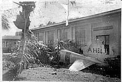 The photo to the right is one that was taken of the Kam Zero in the immediate aftermath of the attack. The photographer was a soldier at Fort Kam by the name of William Vigus. His family posted this picture on the internet a few years ago. As you can see, it's grainy and has a tear in the top center. I thought the picture was worth restoring because unlike other photos of the Zero from the same angle, Vigus' photo shows wreakage stuck in the palm tree and also shows some other buildings in the background.
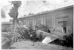 I tried to reduce the graininess by setting black and white levels, and then using just a hair of Gaussian blurring. While the result (below) has no tear, it lack some of the clarity of the original. I attribute that to inexperience with tones, but I'll have to admit that the original photo was a low-resolution file one and this made it difficult to increase detail.
The Coat of Arms for the Defenses of Pearl Harbor
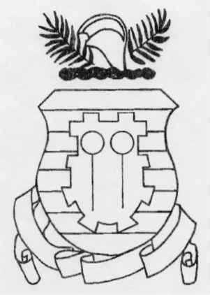
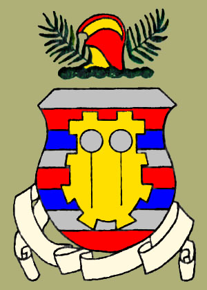 One of the many pieces of information I have picked up during this project is a drawing of the Fort kam coat of arms. This was faxed to me by a fellow researcher who, like me, used to live a the Fort. The origginal drawing was black and white, but it featured a decsription of the colors of the complete shield. Using this color scheme, I colorized the drawing to make an icon that I hope to eventually make part of the banner. The motto, "Defender of the Pacific Pearls," will go into the scroll once I get Photoshop text shaping under control.