Image Assignment
They carye a quiuer made of small rushes holding their bowe readie bent in on hand, and an arrowe in the other, radie to defend themselues. In this manner they goe to warr, or tho their solemne feasts and banquetts. They take muche pleasure in huntinge of deer wher of theris great store in the contrye, foryt is fruit full, pleasant, and full of Goodly woods. Yt hathe also store of riuers full of diuers sorts of fishe. When they go to battel they paynt their bodyes in the most terible manner that thei can deuise.Thomas Harriot--A Briefe and True Report of the New Found Land of Virginia.
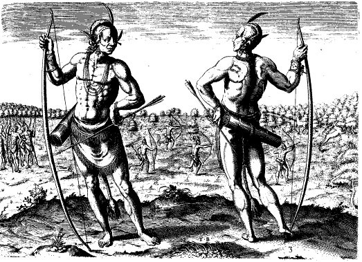
Weroan Chief (Before) Black and White
Purpose of the page
This page is the placeholder for the next assignment for the class. I thought that it would be useful to keep making progress on my type assignment as well as making progress toward the design project. I went with one column in order to maximize my main space. I am still wondering what the best size for the parchment is for this layout but this is a start.
Choosing the Image
This image is famous and is used in many monographs and textbooks. This is an engraving by Theodor de Bry, 1590 after a John White watercolor, 1585. Virginia Indian chief with tattoos. Caption: "A weroan or great Lorde of Virginia." I chose this version of the image because there was a lot that could be done to make this better. I got it from the Alexander Street Press database Encounters in Early America. This image also works nicely because natural history includes people as well as plants and animals. In my final design project I want to take an image that represents these different parts of natural history as a visual background cue that melds the content of the page and the images together. In order to do this I think it will be important to create the right kind of blending and fadding strategies so that the image will join with the parchment background as seamlessly as possible.
Problems with the Image
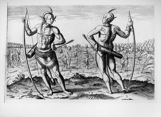
Weroan Chief Engraving Grey
Some problems with the image that jumped out at me was the large size. Also it contained lots of detailed background parts but it seemed to me the focus on this image should be the front view of the chief. This was a noble man that was confident in his place in the world. Also this is a black and white image which will require some work to make it tranisition into my parchment background. Also I found the tattoos very diffficult to see in this version of the image. For example, I found another version of the image that appears to have been either altered or perhaps a different scan produced a drastically different image. Notice specifically the tattoed body of the chief. Again I faced a choice. I worked with both images for a few weeks trying different shading options. Also I realized that the two images were different sizes. The grey version was much larger. Details showed up better in the image. When I made it the same size as the b&w version some of that advantage was reduced. I finally decided to choose the black and white image because I believed that I thought that it needed more work and I needed to choose since the deadlines are starting to loom.
Cropping and Resizing the Image

Cropped and Resized
This was a simple process once I decided what part of the image I wanted to keep. After selecting the forward facing chief, and making sure that I didn't cut one of the warrior hunters in the background in half, I cropped the image. I practiced this several times to get the right cut. Following that I realized that I could enlarge the image to 400px width and 520px height in order to get more detail. I choose bicubic smoother to assure better enlargement. This didn't cause many problems. The sacrifice of cropping this image is that I lost part of the hunt scene and more of the forest backround. This was less important to me because my goal was to remove the chief from this background anyway in order to use it in my design project.
Cleaning the Image
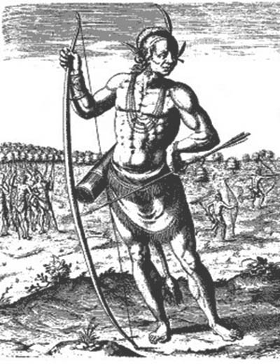
I blending and cleaned the image using curves to try to reduce the darkest areas of the image. This brought greater definition in the chief's midsection and arms. It also provided enhanced texture on the ground cover. I also increased the shadows to 80% in order to provide some detail especially around the muscles. Then I decreased highlights 5%. I used the magic eraser in order to quickly select the sky. There were a few spots on the image that were easily removed with the healing tool.
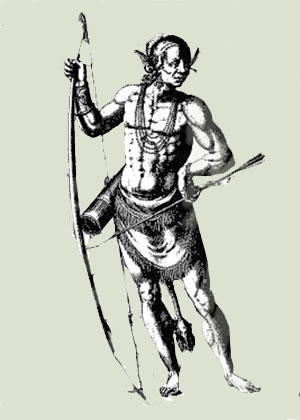
Weroan Chief on Parchment Matting
Matted Image
I am continuing to experiment with images. This one removes the background and replaces it with a matting using my parchment background. This was very time consuming and I am still not happy with the outcome but it is a start. The magnetic lasso tool was very handy for this but there are so many subtle lines in this image that make it very difficult to get everything that you want. I was able to combine my chief with the parchment in Adobe Illustrator. I am sure there was a way to do it in PS but alas the point of least resistance ended up winning the day because of the amount of time spent learning other parts of PS.
Colorized
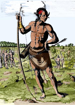
Weroan Chief Colorized 1
I should have picked an easier picture to colorize. I did try to thin about subtle greens, yellows, browns and a pale blue for the sky. At one point I was really trying to reproduce the watercolor that this image was based on. I gave up on drawing the intricate tattoos on the chief and focused on doing a good job with the background and the skin tone. I really tried to use the greys and blacks as marker points to darken the color in the image. I used several layers in order to get the most control over my color options. I alternated the opacity level on all color layers ibn order to soften the colors of the background. In general I tried for softer colors farther away and richer colors up close. I removed many of the grey clouds and replaced them with various types of whites.
Image2
Having landed on one of the Florida Keys, I scarcely had time to cast a glance over the diversified vegetation which presented itself, when I observed a pair of birds mounting perpendicularly in the air, twittering with a shrill continued note new to me. The country itself was new: it was what my mind had a thousand times before conceived a tropical scene to be.---John James Audobon---Birds of America Volume 1. --
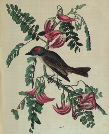
Bird Image before
Choosing the Image
This image is a watercolor of a Pipiry Fly Catcher. It was created by Audobon in 1844. I got the image from the Early Encounters in America database created by Alexander Street Press. I chose this image because I think it is representative of many images drawn by those that studies natural history. This particular image has some interesting flowers as well as fauna. In order to us this image as a background image for the left side I had to flip the direction so that the bird is looking left to right. I also saw several spots on the image. Worse yet there were several spots where faded text could be seen. Lots of clean-up needed to happen. I had several versions of images including ones that removed all of the flowers but in the end I decided to use this image to show the progression of learning the fade strategy.
Side Image 1
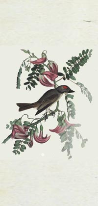
Cropped and resized and blending
The blending that I tried here was tedious. I used the eraser to try to get the appropriate effect. Professor Petrik showed a much quicker way of doing things by adding a layer and using the gradient tool. See the side image below.
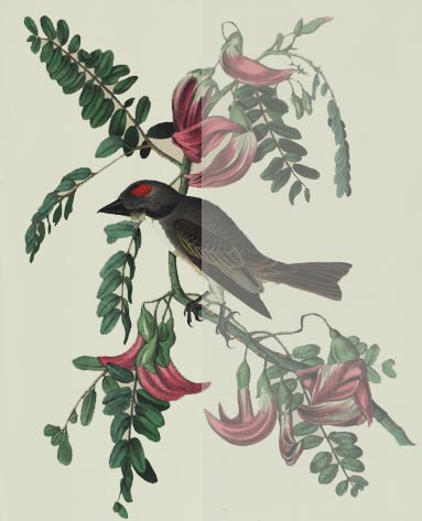
Cleaned up and use fade trick
Using this new trick the process only took 5 minutes. Wish I knew this earlier. I think I might be able to use this strategy in the design process but I need to get a little better with my css skills.
Vignette
In the portrait which accompanies this sketch, he appeared in the costume in which he presented himself before the President of the United States, at Washington, in 1824, when he visited the seat of government as a delegate from his nation. It must have been a singular scene, which exhibited the savage orator, painted in fantastic style, and clad in these wild and picturesque habiliments, addressing the grave and dignified head of the American people, in one of the saloons of the White House. The President and his cabinet, with the diplomatists and other visitors who are usually invited when a spectacle of this kind is presented, must have afforded a striking contrast to the war chiefs and orators of a savage horde decked out in all the barbarian magnificence of beads, paint, and feathers, with their war-clubs, pipes, and banners.
This is a portrait of Hoowanneka (the Little Elk) who was a chief of the Winnebago nation. He fought alongside the British during the War of 1812. He and the Winnebagoes made peace with the Amricans after the Treaty of Ghent.
This series of images shows my experimentation with a distressed look to the vignette. Using the vignette strategy I created the appropriate layers and made several very plain vignettes. I thought that it might be interesting to experiment with creating a distressed look. I took the eydropper tool and selected the distressed leather object protecting the chief's stomach area. This gave me a nice blue/grey/green color that reminded me of the type of paper that many people matte photographs on. I used this color as a background layer. After that I used the magic eraser tool and began to experiment with removing parts of the top layer. I really like the look of this strategy. I was particularly pleased with the highlight of color in the oval around the image.
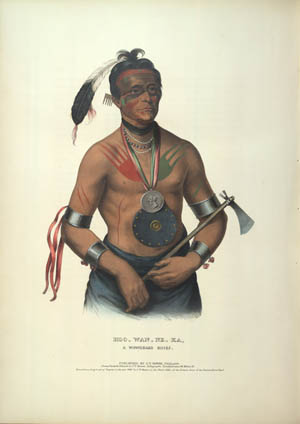
Hoowanneka: A Winebago Chief
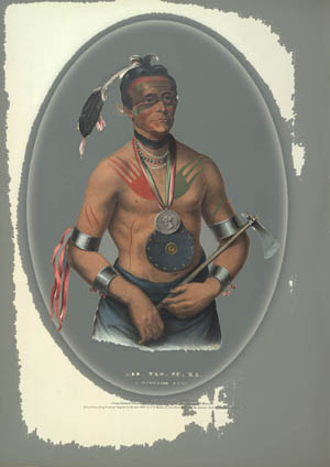
Hoowanneka: A Winebago Chief
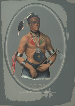
Hoowanneka: A Winebago Chief
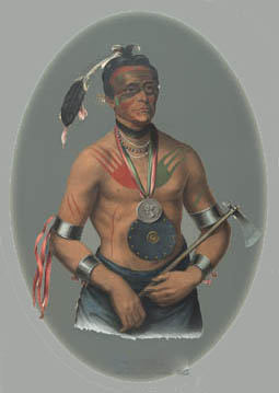
Final Vignette Image
Final Version Vinette
This is the final vinette image. I think it has a nice blur look. Iused a quick and dirty method to remove the text that was on the image. When I do the final project I need to remember to do that early in the process.
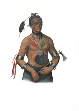
I guess it is clear that I like this image. I ended up putting this on a white background layer
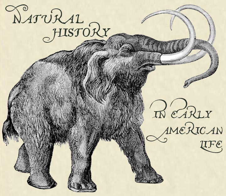
I am still working with this image but I am not happy with it yet.
