Maps, Some New Looks
Barry A. Klinger
AOES Dept Home Page
Maps are a central feature of oceanography and climate science, and of course I view maps all the time when I am navigating the roads or reading the news. Often I find that important information is not well-conveyed by a map. After a while I started making my own "home-made" alternative maps. Most of these are static (as opposed to interactive) maps created with the Matlab programming language. I believe these maps improve on generally available examples. Here I display some of these improvements and discuss which features can be adopted elsewhere and which are unique.
A Guided Tour of New Maps
- Large-Scale Maps
- Topography
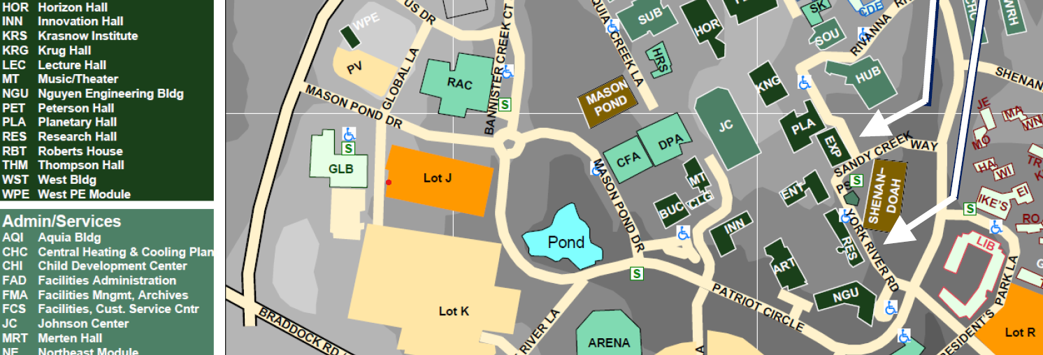
- Finding Buildings on a Map
- Municipalities
- Socio-Political Maps
Maps are Messages... and Talismans
I have been studying maps of all kinds since literally before I knew how to read. My father taught me the names of countries by showing me the globe on his desk. I remembered the countries by the shape and by the color. Each one glowed like it was radiating light: China in yellow, Russia orange, and the United States, confusingly, in a different color for each state.
For my father's purposes, his globe was extremely well-designed. The bright colors were alluring to a small child, and differentiated the countries from each other. A map showing physical features such as mountains or biomes would have made the countries less salient. The resolution was appropriate to showing countries. Of course, the fact that the globe was a sphere conveyed the mind-blowing information that the Earth itself is a giant ball.