
Task 1. A Cropped and Resized Image
I started with one of the great Toni Frissell pictures of the Tuskegee Airmen from World War II. As much fun as the frame is -- very old school, since some people probably have never seen what an image looks like when it's from film instead of starting as digital -- it takes up a lot of space that doesn't add to the picture.
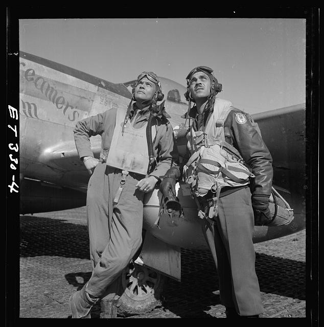
COL Benjamin O. Davis and Edward C. Gleed at Air Base at Rametti, Italy
Source: Library of Congress, Toni Frissell Collection, LC-F9-02-4503-330-4
That's an easy one in Photoshop. Two options. (Option 1) Pick the Crop tool. Select the part you want to keep. (Photoshop courteously grays out the rest.) Hit return. Cropped picture. (Option 2) Pick the Rectangular Marquee Tool. Select the part of the picture that you want to keep. Right click and choose "Select Inverse" from the menu that appears. From the main menus, choose Image and then Crop. Cropped picture. Whichever option you pick, next, change the image size to make it a reasonable size by choosing the Image menu and then "Image Size" and changing the picture's width or height to a different number of pixels or inches or whatever unit suits you and your design. Think long and hard before you decouple the dimensions unless your project is about the 1960s, because distortion happens, and history already has enough distortions.
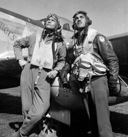
COL Benjamin O. Davis and Edward C. Gleed at Air Base at Rametti, Italy
Source: Library of Congress, Toni Frissell Collection, LC-F9-02-4503-330-4 (ALTERED)
Here's the image cropped and resized. I thought it was important to keep the plane in the picture to give the image some context.
Task 2. A Restored Photograph
Here's a beat up picture of General (later President) Grant, looking a little beat up himself.
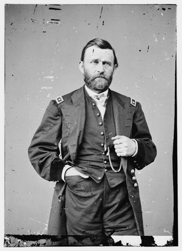
General (Later President) Ulysses Grant
Library of Congress, Item LC-DIG-cwpbh-00971
He needs some work. Let me repeat for the record my objections to changing pictures, especially paper ones: a paper photograph is an "original" document and as they say, "it is what it is." I think there's merit in seeing how the picture was done originally (like the photograph "frame" around the first picture above, the one of the airmen), how it was treated, and how it survived over time. I worry that we reduce our credibility as historians if we change "factual" things -- if I cannot be trusted to present pictures "as they happened," how can I be trusted for the rest of my content? Of course, history isn't just about the facts but the interpretation, but a picture is a pretty basic thing to be changing. The "original" picture isn't different after a copy of it is Photoshopped any more than the Battle of Hastings wasn't 1066. But I'm willing to undertake the process of learning how to modify pictures for the reasons taht Dr. Petrik offered, because it's a good skill to have, and teaches us things about how to use Photoshop. (Particularly about how much attention, time, and patience it can require!)
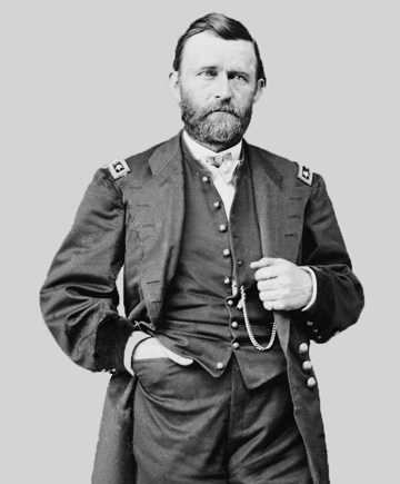
General (Later President) Ulysses Grant
Library of Congress, Item LC-DIG-cwpbh-00971 (ALTERED)
Given that disclaimer, I started by cropping the picture as described above to take out some of the outside edges of the picture -- that framed the picture a little better and also cut out some of the damage. Then I started cleaning up the background. I used the Quick Selection tool (and a lot of patience) to get the dotted lines around just General Grant, including his officers' insignia. Then I did "Select Inverse" again. From the Edit menu, I chose Fill. Then I played around with the gray colors until I found one that didn't do too much violence to the original color in the picture. I set the Opacity to 100%, since one of my goals was to make the damage in the background invisible. I admit that I think adding the background in makes the picture pop a little bit, gives it something of a three-dimension aspect. That took me a ways toward clean up, because the damage around General Grant "disappeared" behind the fill. That left me with Grant himself to repair. I didn't use layers, but I did save different versions frequently, and I spent a lot of time with the Spot Healing Brush Tool (at various dimensions), which uses the pixels around the damage to "fix" the damaged pixels. Where the damage was too big (too many pixels in dimension), I used the Patch tool to grab sets of pixels that were about the right color and essentially copy and paste them over the damage. The folds of the clothing were the hardest, of course, especially where there was damage. It was a little hard to tell what was damage and what was the colors of the drapes of the fabric. (I also got a little carried away and almost took out his lapel button holes and the buttons on one of his coat sleeves before I realized (at 500% magnification) that they weren't "damage"!) The result isn't perfect, but I think it shows what Photoshop can do.
Task 3. A Hand-Colored Photograph
Library of Congress, Toni Frissell Collection
LC-F9-4503-314-7
Incorporate by reference all of my misgivings about retouching photos to coloring photos; incorporate also my agreement with Dr. Petrik's position that doing this teaches you a lot about using Photoshop. Moving on to the assignment, I immediately saw this as by far the biggest challenge of the assignment, and I spent a lot of time looking for pictures that could work. Frankly, I was pretty uncomfortable with the idea of putting color to people's skin, as all of race may be a social construct, but there are a lot of social constructs about skin tone. But I also wanted to do something interesting that would be a challenge. I worked on a picture of Secretary of War Stimson that I found. I started by changing the picture's mode to RGB. I used Auto Tone, Auto Contrast, and AUto Color to let them do what they could. Then I started filling in colors. I spent a lot of time working with levels of transparency until I got an effect that I liked. Sometimes more transparency really helped, but a lot of times a little more transparency brought out, for example, the highlight on the arm of the jacket. The hat, the jacket, and the pants worked really well, and I like the colors that resulted. The hills were a bit harder, and I'm not entirely satisfied with the way they turned out. One thing that I was surprised about that I think showed the advantages of Photoshop: I didn't really see the form of the building in the distance until I gave it some color. I also played with the light levels like we learned in class, taking out some of the area outside the main part of the histogram and adjusting the overall light/dark level just a little bit. I also discovered pretty quickly as I updated the webpage to see how the picture was actually displaying that the edges of the picture where they met the background were really stark on the webpage. I used the Blur tool that we talked about in class to blur the edges a bit, and I think that really helped without making the picture murky.
Library of Congress, Toni Frissell Collection
LC-F9-4503-314-7 (ALTERED)
Some things I learned: I kept the original version of the picture up to compare so I could tell what was what, having learned that with the Grant picture where I almost got carried away taking out "damage" that was actually supposed to be there. I was keeping a color list (after learning the hard way that if you leave an attempt and don't keep track of them, it seemed very hard to recreate). Then I decided to explore the sampler tool, which has two settings, one of which will let you pick just the color of the top layer. That let me grab the "right" color again when I needed it or when I learned that I'd missed a little area. At the end, I also played around with the Auto Tone and Auto Color (which didn't work) but the Auto Contrast actually deepened the colors a bit and gave the whole a richer tone that I ended up really liking.
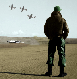
Task 4. A Vignetted Photograph
This is an interesting picture of a senior officer congratulating some of the airmen. What really caught my attention, however, is the airman in the background -- he is totally playing to the camera and he's got a happy or maybe just goofy expression on his face. He might get lost in the photo otherwise.
CAPT Hall, the First Tuskegee Airman to Shoot Down an Enemy Plane, is Congratulated by MGEN Cannon
Source: AF Museum, Item 090908-F-1234S-012
A Tuskegee Airman in Europe During WWII
Source: AF Museum, Item 090908-F-1234S-012 (ALTERED)
If you vignette him, though, he's his own man -- and what a great looking airman he turns into. I used the Elliptical Marquee Tool and put a circle around my airman. Then I used the "Refine Edge" dialogue box. I expanded the ellipse to get all of the airman but none of the arm of the senior officer. I increased the contrast, so he looked a little more like a traditional portrait instead of someone clipped from a more candid shot. I selected the inverse and then filled the inverse with the dark gray. I filled a couple more times to darken up the gray until I got an effect that I liked -- like the mat of a picture. Then I used the Rectangular Marguee Tool to pick a square with enough mat to make the picture work and cropped the extra part of the picture. Now he can stand by himself and look almost like a formal and traditional portrait.
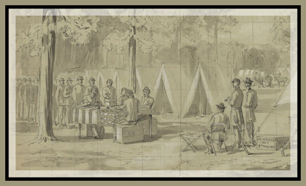
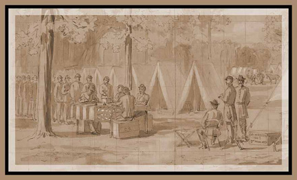
Task 5. A Matted Engraving
Here's a sketch from the Library of Congress of soldiers voting during the Civil War. It looks like it was drawn on graph paper and made up of two pages taped together.
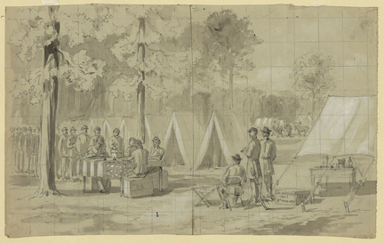
Pennsylvania Soldiers Voting, Army of the James
Source: Library of Congress, Item LC-DIG-ppmsca-21710
To start, I pretty much followed Professor Petrik's method. I cleaned up the mar in the bottom middle. I like the effect of the graph paper and the idea of the artist using whatever paper was to hand, so I did not try to eliminate the lines, though I did clean up a little at the bottom where I would guess the sketch was folded in half. (After some struggle with the Patch tool, I used the Eyedrop sampler to grab the nearby color and put that color over the shadow from the fold.) I cropped out some of the trees at the top and some of the tent on the right to put the focus more squarely on the men themselves. I did the Image/Auto Tone, Image/Auto Contrast, and Image/Auto Color functions.
When I got to adding the mat, however, I added some borders instead. I added an inside border using Edit/Stroke and adding 20 px of "Inside," Blending at Normal and Opacity at 50%. Then I used Canvas Size to add 20 pixels of white. I sampled a color from the sketch and then added 30 pixels of the sampled color as the outside border.
Pennsylvania Soldiers Voting, Army of the James
Source: Library of Congress, Item LC-DIG-ppmsca-21710 (ALTERED)
Then I used the Action menu to make the whole thing "sepia," which changed not only the image but the frame as well. Not sure which I like more, but the sepia gives the image a hint of color, which I think is a nice effect.
Pennsylvania Soldiers Voting, Army of the James
Source: Library of Congress, Item LC-DIG-ppmsca-21710 (ALTERED)