Northern Virginia Winter Weather
Barry A. Klinger, Winter 2014, 2015
Return to Local Weather and Climate
Sections:
Cold Winters, Snowy Winters, and Global Warming
Are DC Winters Getting Colder?
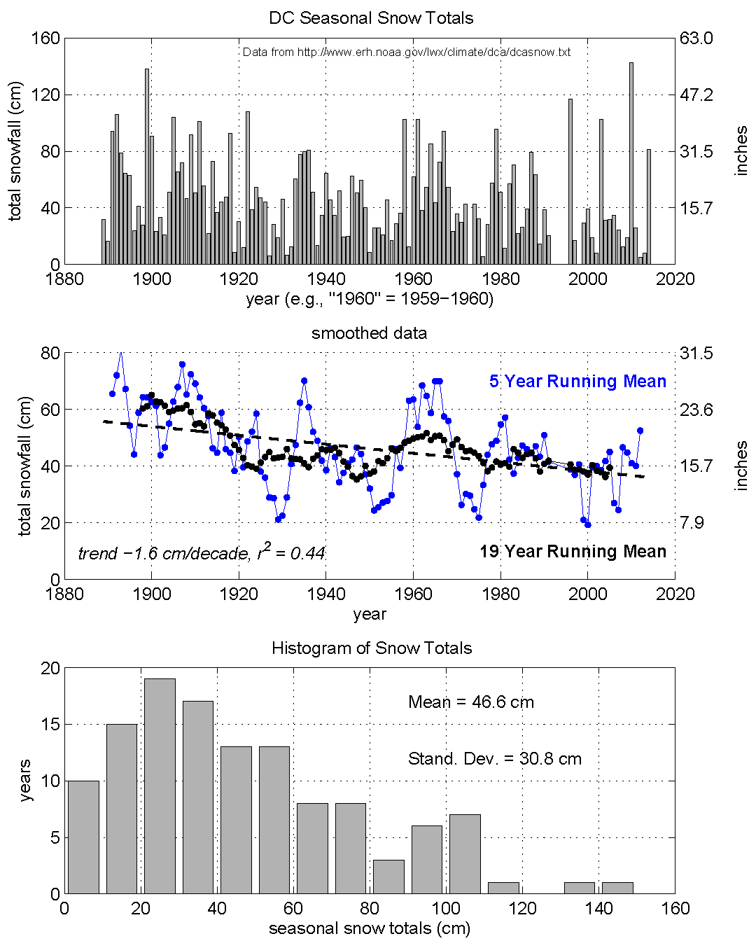
120+ Years of Snowfall
Cold Winters, Snowy Winters, and Global Warming
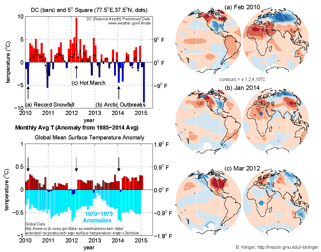
Washington DC has had some bitter winters including "Snowmaggedon" in 2010 and the so-called "Polar Vortex" rampaging south across the DC metropolitan area and much of the US in 2014. The figure at top left shows Washington DC monthly average temperature anomalies. It shows some of the cold events along with warm events such as March 2012. Do the cold spells and snow storms show that global warming is not happening?
Local temperatures have much more dramatic swings than global temperature. The bottom left panel shows the global average temperature anomaly. This has much smaller ups and downs and does not even go in the same direction as the Washington temperature. Even the average temperature over the 5 degree wide "square" centered at (77.5oN,39.5oW) shows less variation than temperature measured at the airport (top left panel, dotted black line). However, we can see that recent global temperatures (blue and red bars) are all much warmer than temperatures from the early 1970s (light blue bars - 1970 temperatures are shown in 2010, 1971 in 2011, etc.). Global warming has occurred over recent decades.
Why is local and global temperature so different? It is because weather moves heat around from location to location, cooling some regions and warming others. The global temperature maps (right panels) shows this effect. When the eastern US was cold (top two maps), there were compensating warm regions in Canada, Africa and Asia.
By the same token, hot weather in DC (March 2012, bottom right panel) is also partly compensated by cool regions in Alaska, Australia, and Siberia. Local weather can not prove or disprove global warming. However, global warming implies that as time goes on, there will be more warm months and fewer cool months. Some details about maps:Global temperature maps are from the NOAA Merged Land-Ocean Surface Temperature Analysis (MLOST) downloaded March 2015. Maps are equal-area so that two regions that have equal area in the figure represent regions that have equal area on the globe. Note that for stronger temperature anomalies, the contour interval is also bigger. This allows more precision for large areas with weak anomalies while preventing clutter from too many contours in small areas with strong anomalies.Jason Samenow (Capital Weather Gang) on the cold February and global warming
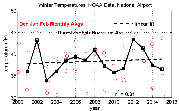
Are DC Winters Getting Colder?
A recent article by the Washington Post Capital Weather Gang's Matt Rogers highlights a cooling trend in "colder-trending" extreme temperatures during Washington-area winters since 2000. The article was based on statistics of high and low temperature extremes during recent winters.