Skeptics often point to satellite measurements of atmospheric temperature as a sign that global warming is small and has not happened in a long time. Satellite measurements with the Microwave Sounding Unit (MSU) are used to infer the average over much of the vertical extent of the troposphere (Lower Tropospheric Temperature, or TLT). This is then averaged over almost the entire Earth (for instance from 70oS to 80oN) and used as a measure of global temperature.
Many scientists use surface air temperature (conventionally 2m above the ocean or land surface) instead of the satellite measure to monitor global warming. Some politicians have accused scientists of focussing on surface data in order to exaggerate the extent of global warming. There are several reasons for using surface values: for one thing, humans live on the surface of the Earth, not the middle of the troposphere, and for another, the MSU record only goes back to 1979 and widespread surface data stretches back to the 19th century. Nevertheless, if we want to understand climate behavior, it is relevant to to ask if atmospheric temperature is consistent with surface temperature.
Some technical details: several groups have calculated global mean temperature from satellite data; here I use the RSS data. Similarly, of several global mean's based on ground-based and sea surface measurements, I have chosen the NCDC data.
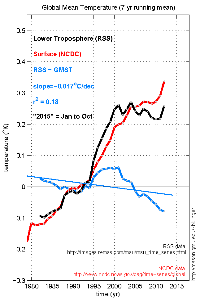
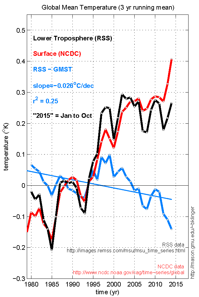
The first figure shows that, over the life of the satellite measurements, both RSS tropospheric temperature (black curve) and NCDC surface temperature (red curve) have gone up by at least .3oK. There are some discrepancies, however (shown by blue curve), notably RSS is warmer than NCDC in (1) the early 1980s and (2) the late 1990s and has been (3) getting colder than the surface since about 2005. NCDC shows a "pause" in warming from about 2006 to 2012, but in RSS, because of discrepancies (2) and (3), the pause starts earlier and has not ended yet. Thus there are similarities and differences in these two measures of global temperature.
In order to eliminate short ups and downs in temperature that are not very relevant to the long term trend, the first figure uses a 3 year running mean (ie, year "2002" temperature is the average of years 2001, 2002, and 2003). A 7 year running mean (second figure) eliminates more of the short term variability. This smoothed plot shows more clearly the modest tropospheric warming in the 80s, fast warming in the 90s, and lack of warming in the early 2000s. The surface temperature increases more steadily over the entire period.
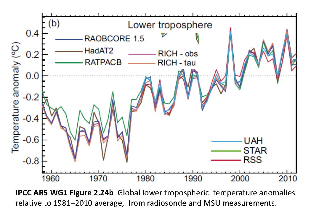
Both satellite and surface estimates are created by many steps of data gathering and calculations, with many opportunities for error to creep into both global averages. The differences between the two time series of data could be due to errors in one or both of the data sets or could represent real differences between the surface and higher altitude temperature variability. There are a variety of satellite and radiosonde ("weather balloon") measurement of tropospheric temperature; of these, other measurements have up to about .1oK more warming than RSS (IPCC 5th Assessment Report Working Group I, fig. 2.24, reproduced here).
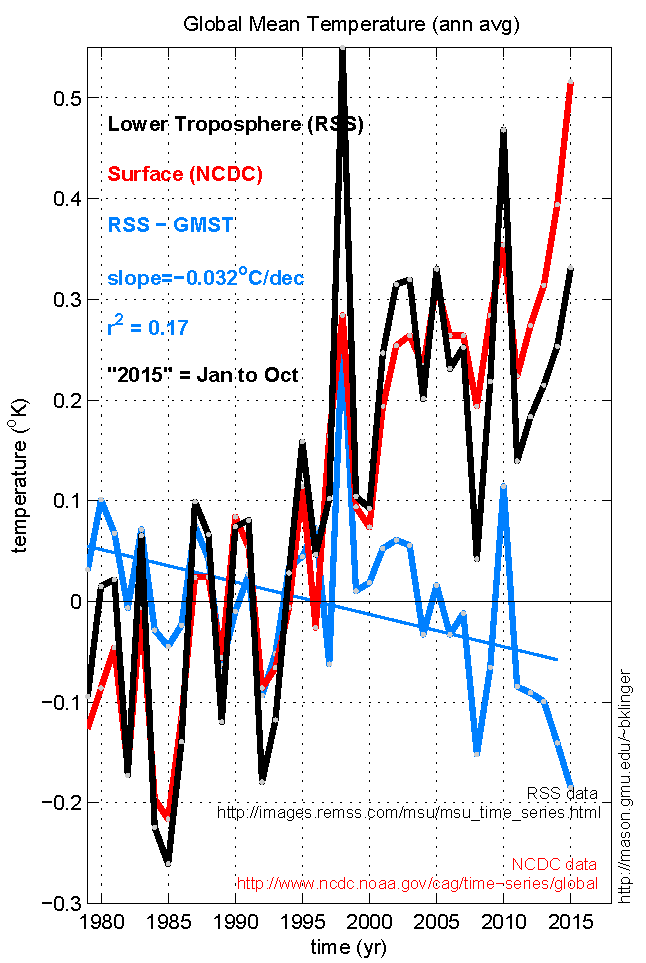
To get a better idea of the source of the difference between the two sets of data, I plot the annual averages (third figure). Much of the "early start" of the warming pause (1998 in RSS, compared to 2006 in NCDC) is due to a single year: 1998. The temperature was influenced by the record-setting El Nino that year, which evidently made a much greater warming in the atmosphere than in the ocean.
If the RSS temperature anomaly in 1998 alone had been the same as at the surface, the pause in the satellite-measured warming would have started in 2002 (for 3-yr mean) or 2005 (7-yr mean) rather than 1998. On the other hand, the tropospheric temperature anomalies stayed cooler than the surface for every year after 2010. Thus the difference in start time of the pause is largely explained by a feature of short-term variability that is probably unrelated to long-term trends, but the difference in end time of the pause may represent a real discrepancy between the trend as measured by two data sets.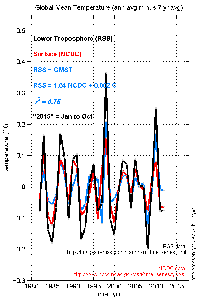
Why did satellites measure tropospheric temperature to be so warm in 1998? I don't know, but the spike in warming was not unique to 1998. We can isolate the short-term temperature fluctuations by subtracting the 7-year running mean from the annual-mean data. As the fourth figure shows, RSS fluctuations typically go in the same direction (either warm or cold) as NCDC, but are about 60% bigger. If we consider the "signal" to be the decadal trends in the temperature, the satellite data is much "noisier" than the ground-based data.
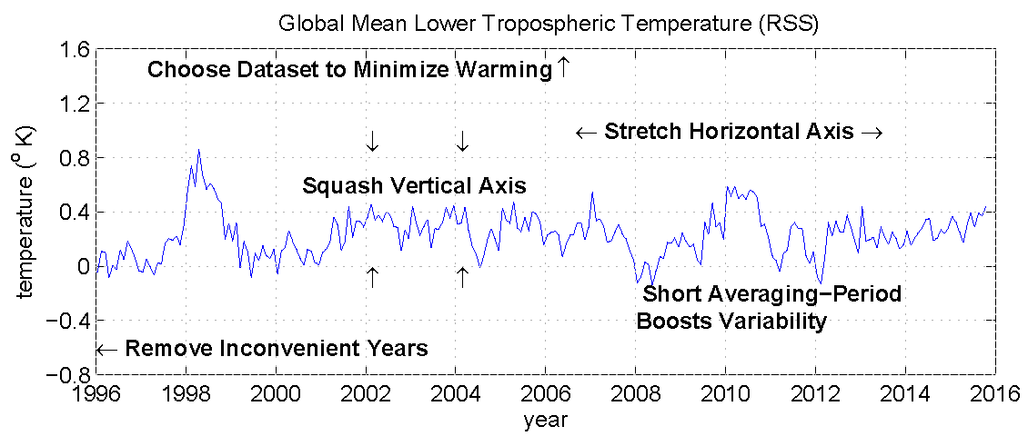
In some contexts this plot would be completely appropriate. It does a good job at displaying the detailed behavior of global mean temperature in recent years. However, for evaluating whether there is warming of a few tenths of a degree from decade to decade, figures 1-3 are more appropriate.
Last modified: 10 Dec 2015