1. Monthly Temperature Variations
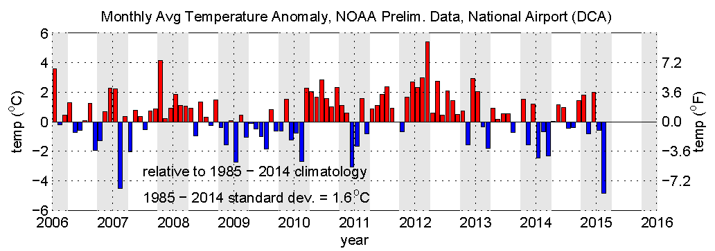
Winter 2014-2015 has been feeling awfully cold, so I was curious about how local monthly means this year and in the recent past stacked up to climatology. Here's an answer based on data from www.weather.gov/climate/ and http://www.erh.noaa.gov/lwx/climate/dca/. See figure above, where gray bands mark Oct-Mar.
February was indeed one of the coldest on record, and last winter (the one that popularized the "polar vortex") was pretty cold too. December 2014 was actually on the warm side though.
You may also remember some miserable recent summers in the DC area. We had a run of warm summers for 2010, 2011, and 2012, then close to average the last two years. It's funny, I remember 2013 as being a very hot summer because I was relieved to escape to coastal Maine in the middle of summer and then found that it was 90 deg F there too!
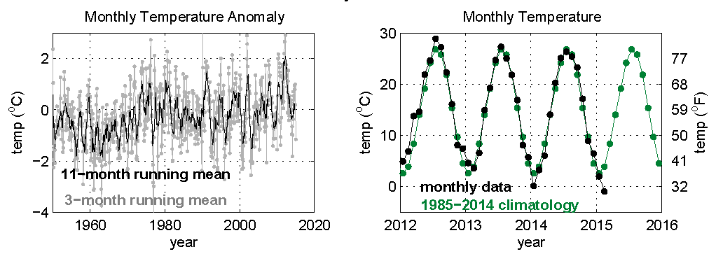
Using a running mean to give approximately annual and seasonal temperatures in DC (above left), we see longer-term variations. The temperature warms a bit over the period. Actual temperature values (above right) has a large seasonal variation every year.
2. Cold Winters, Snowy Winters, and Global Warming
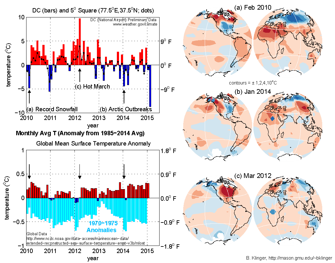
Washington DC has had some bitter winters including "Snowmaggedon" in 2010 and the so-called "Polar Vortex" rampaging south across the DC metropolitan area and much of the US in 2014. The figure at top left shows Washington DC monthly average temperature anomalies. It shows some of the cold events along with warm events such as March 2012. Do the cold spells and snow storms show that global warming is not happening?
Local temperatures have much more dramatic swings than global temperature. The bottom left panel shows the global average temperature anomaly. This has much smaller ups and downs and does not even go in the same direction as the Washington temperature. Even the average temperature over the 5 degree wide "square" centered at (77.5oN,39.5oW) shows less variation than temperature measured at the airport (top left panel, dotted black line). However, we can see that recent global temperatures (blue and red bars) are all much warmer than temperatures from the early 1970s (light blue bars - 1970 temperatures are shown in 2010, 1971 in 2011, etc.). Global warming has occurred over recent decades.
Why is local and global temperature so different? It is because weather moves heat around from location to location, cooling some regions and warming others. The global temperature maps (right panels) shows this effect. When the eastern US was cold (top two maps), there were compensating warm regions in Canada, Africa and Asia.
By the same token, hot weather in DC (March 2012, bottom right panel) is also partly compensated by cool regions in Alaska, Australia, and Siberia. Local weather can not prove or disprove global warming. However, global warming implies that as time goes on, there will be more warm months and fewer cool months. Some details about maps:Global temperature maps are from the NOAA Merged Land-Ocean Surface Temperature Analysis (MLOST) downloaded March 2015. Maps are equal-area so that two regions that have equal area in the figure represent regions that have equal area on the globe. Note that for stronger temperature anomalies, the contour interval is also bigger. This allows more precision for large areas with weak anomalies while preventing clutter from too many contours in small areas with strong anomalies.Jason Samenow (Capital Weather Gang) on the cold February and global warming
3. Are DC Winters Getting Colder?
A recent article by the Washington Post Capital Weather Gang's Matt Rogers highlights a cooling trend in extreme temperatures during Washington-area winters since 2000. The article was based on statistics of high and low temperature extremes during recent winters.
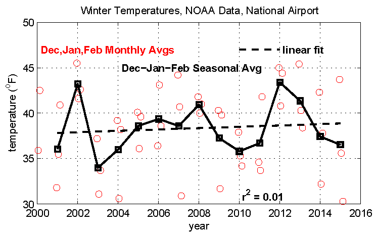
A more straightforward way to examine the seasonal temperatures is to simply look at averages rather than extremes. The plot above shows monthly average temperatures (red circles) for each December, January, and February since December 2000. The graph also shows seasonal averages (December to February). Neither measure of winter temperature shows any obvious trend. Fitting a straight line to the trend produces a slight warming, but it is not statistically significant (as measured by a correlation coefficient of r2=.01). As an example of how fragile the small warming trend is, note that changing the year 2001 temperature from 36 to 40 would be enough to change the warming trend to a cooling trend.
For a more complete discussion of trends in DC-area temperatures, see the next section.
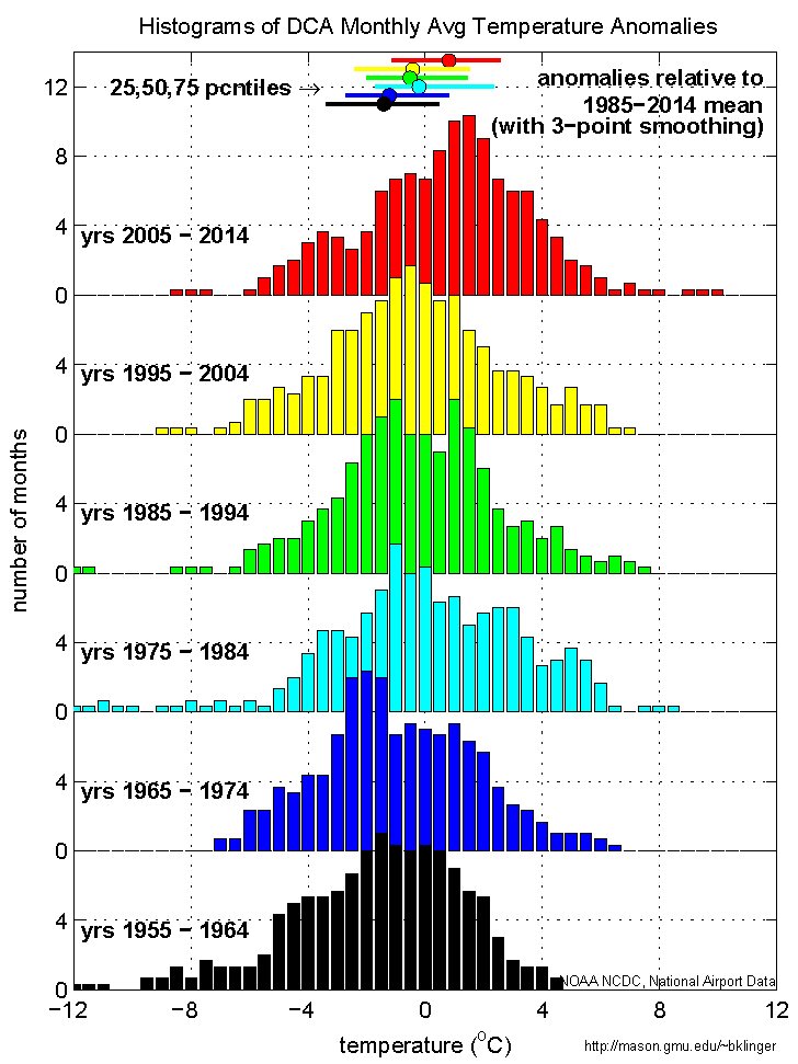
4. Changing Temperature Distribution
Is it warmer than it used to be? The last couple of winters has people asking about the cold instead. Here is another way to think about if and how the weather is changing in the DC area.
The plot at right shows a frequency distribution of different temperature ranges shown at the bottom of the figure. The data is broken into 10 year intervals. Each bar represents how many of the 120 months of a given decade had a temperature within .25o C of the temperature under the center of the bar (see bottom of graph). The temperatures shown here are differences from the climatological (1985-2014) average for each month of the year. Each distribution is offset by a different amount in the vertical in order to make all of them easier to see.
The distributions move from right to left as we go back in time, indicating that there were more cold months and fewer warm months in (for instance) 1955-1964 than in 2005-2014. All the distributions overlap, meaning that all decades had temperatures that were close to the 1985-2014 average, but the most common anomaly in 2005-2014 was about 3o C warmer than the most common anomaly in 1955-1964.
The median temperature anomaly of each decade is shown by the horizontal position of a dot at the top of the figure (color coded by distribution and displaced a bit in the vertical from each other for clarity). The horizontal bar through each dot shows the range from the 25th percentile to the 75th percentile for that decade. These show that the median temperature anomaly for 2005-2014 is warmer than 75% of the anomalies in 1955-1964.
To summarize, the distributions show that, although there are always unusually warm and unusually cold months, an "unusually cold" month in the 2000s would have beeen considered close to average in the early 1960s.
Technical notes: data came from the same source as Monthly Temperature History. To improve clarity, the frequency distribution numbers were smoothed with a three-point running mean. The unsmoothed data shows a similar shift with time.
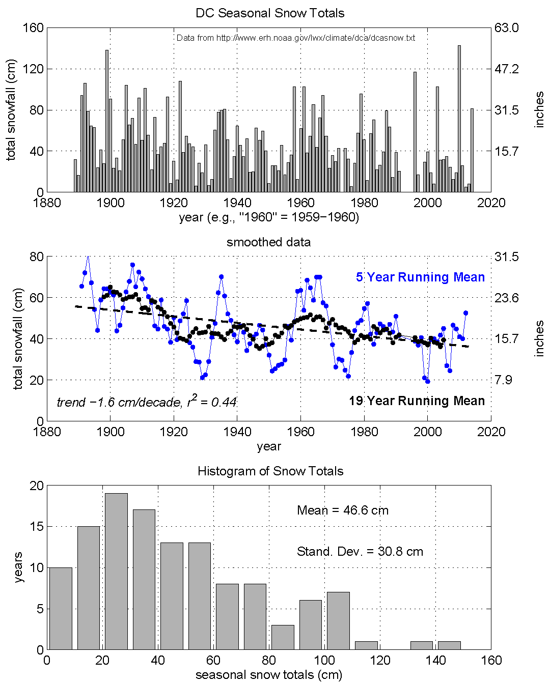
5. 120+ Years of Snowfall
DC-area annual snowfall has always had tremendous variations. As the top panel of the figure shows, alternating years can have snowfalls ranging from 10 inches to 40 inches.
Despite the record breaking snowfall in 2009-2010, the long-term
trend in snow is actually
The bottom panel in the figure shows how many years had each range of snowfall. It shows that the most common amount was 20-30 cm (8-12 inches), with most years getting no more than 80 cm (31 inches). About 10% (very roughly) of the years since 1880 have had more than a meter of snow.
For Non-Experts: Some Definitions
Climatology refers to the field of climate science, but within climate science it usually means a data set that has been averaged over a number of years. For example, the climatology of March temperatures is the average of every March during a certain time period (the March temperature for a given year is itself an average of measurements taken twice every day of the month). A standard period for calculating climatologies is 30 years.
Anomaly is the difference of a particular value from its climatological value. For example, here the March 2010 temperature anomaly is the difference between March 2010 average temperature and the average of all March temperatures from 1985 to 2014. Unlike in common usage, "anomaly" does not mean "odd, unexpected"--in fact if temperature one year had no anomalies it would be, well, anomalous!
Running mean does not refer to kicking your competitors when in a foot race, but is simply an averaging process that includes times before and after each time. For instance, in a three month running mean, "March 2010" is actually the average of February-March-April 2010, and "April 2010" is the average of March-April-May 2010.
Last modified: 13 April 2015