All About Aqua


Bright blue is often seen as a symbol for cleanliness, strength, dependability, coolness, trust, and loyalty.

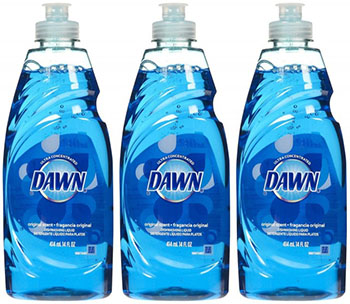
Cleaners, such as soaps and detergents, are often blue or in blue packaging, because they evoke feelings of cleanliness.
Medications often use the color blue when are trying to achieve a calming effect, for example sleep medication.
Blue is the number one favorite color in the world. While this makes it a prime color for designs it can become overused, so it is best to use it in relation with other colors.

Describing a person as "blue" has very different meanings in different cultures. In America, it means to be sad, whereas in Germany it means to be extremely intoxicated.
Featured above is a campaign out of Germany to discourage teenagers from excessive drinking. The translation is "I thought I was cool, being blue is stupid."
Blue is an appetite suppressant, possibly because it is not normally found in natural fruits and vegetables. Our brain may be hardwired to believe that blue is a poisonous color.
Here is the website for Aqua Blue Spa. Not only is "aqua" part of the actual name, it is a color featured heavily on their site. The top of the site is aqua, all of the tabs are blue, and there is a beach scene in the background which shows the water.This is most likely because a spa would want to convey feelings of cleanliness, calmness, and relaxation.
The website for Vicks Nyquil uses the color aqua in a much more subtle way. It is present at the top of the page, and the tabs are also aqua when highlighted. The design also has green mixed in. Again this creates a calming effect, since Nyquil is a medication used to help aid sleep.
Blue Buffalo is marketed as a high-end dog and cat food retailer. "Blue" is in their title, and is also featured in their web site layout and logo. I believe this is because the company wants to evoke feelings of strength, loyalty, dependability, and trust. They want their costumers to feel loyal, and to know that they can trust the company to make quality food for their pets.