The Nitty Gritty
So now you might be wondering what the difference between HTML and CSS is. This is where it might get complicated, but bear with me.
When you put more and more details into your html document such as specific fonts, colors, and margin and padding measurements, your document can become quite long. It's a lot of code to sift through when you're trying to put your actual content, like text and images, onto the document as well.
Don't feel like you have to sacrifice an ambitious or intricate look for your webpage just because it can be difficult to keep all that code straight. A style sheet is your answer.
CSS is code that can be placed on a separate file. This will alter the layout and appearance of the website. By using two totally different CSS files but with the same HTML document, you can completely change the way a page looks. All you have to do is link the CSS file to the HTML by placing "< link rel="stylesheet" href="file.css" />" in the < head > section at the top of your HTML.
Aesthetic Time
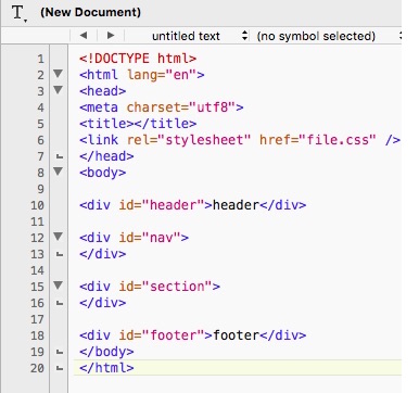
For example, a template of your HTML (complete with a header and footer) would look like the image below.
When deciding how your website layout will look, keep the CRAP Principles in mind. The CRAP stands for Constrast, Repetition, Alignment, and Proximity. A web page with constrast adds variety and keeps it from looking uniform and bland. Granted, you should still have a consistent look for your entire site, but don't be afraid to add contrasting colors and a combination of serif and sans serif fonts.
Repetition may sound sound contradictory, but it actually relates back to the consistency just mentioned. Having the same buttons, colors, and font will give you a signature look your website will be known for. An element that looks completely out of place with the rest of your layout looks like a mistake.
Alignment just means that everything is lined up properly in relation to one another. Likewise, proximity deals with the position of the elements. If a picture is closer to a certain paragraph, the two are associated. Make sure similar information is grouped together.
Typography and Color
This is one of the most fun parts! Depending on your definition of fun anyway. The fonts you put on your website is going to speak volumes. They set the tone and mood for your readers. Distinct fonts such as ones that look like handwriting are just one of the many forms of expression you can create through code.
There are hundreds of them online, so as long as you ensure that the font
is appropriate for your content, go nuts. The same goes for color. And with both, you will need to check that your choices don't negatively
affect the readability of your website. Don't use fonts that make words difficult to decipher or as the bulk of your text. Be mindful
of any clash in colors or brightness that could cause eye strain.
I personally like to use Google Fonts. Find a font you like, and then click on "quick-use". Copy the code it gives you and place it in the < head > section of your HTML.
If you're like me and sometimes have trouble figuring out what colors will look good together, try looking up color scheme ideas. This page has saved my life. It'll offer you inspiration to find a color schemes with shades that exist in harmony. It also has the hex codes for each color presented in case you're interested in incorporating one of the hues into your design.
