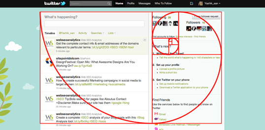

According to our friends at Wikipedia, grid theory is a structure — usually two-dimensional — made up of a series of intersecting straight or curved guide lines used to structure content. Most importantly for our purposes in this class, the grid serves as a framework on which a designer (that's you!) can organize graphic elements like images or even paragraphs in rational, manageable chunks. It is based on the golden ratio, as exemplified here:

The use of grids has increased as Web designers have begun using them more often to create balanced page layouts. In All About Grid Systems, Rachel Shillcock notes, “The good thing about grid systems is that they allow you to design in proportions, balancing between all of the different elements that you might have in your design."
At its most basic, the theory is based on the rule of thirds. "In general, compositions divided by lines that are proportionate to the golden ratio are considered to be aesthetically pleasing," according to web designer Jason Beard.
Excellent question! According to one of the many helpful websites on grid theory, grids allow you to design in proportions, balancing between all of the different elements that you might have in your design. They also provide a foundation and balance, and they play nice with other design principles.
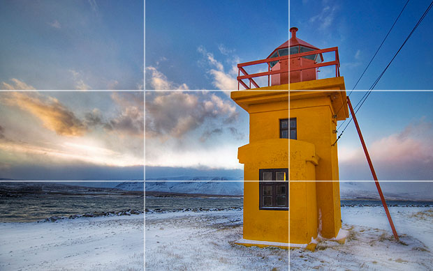
Importantly, the notion behind the rule of thirds and thus grids is that having things slightly off-center results in more interesting composition and therefore attracts more attention. Take, for example, the following image taken from The Photography Nomad:

The Internet is a wonderful thing. You have only to search for "grid theory" and a wealth of information appears for the perusing. But here are some basics:
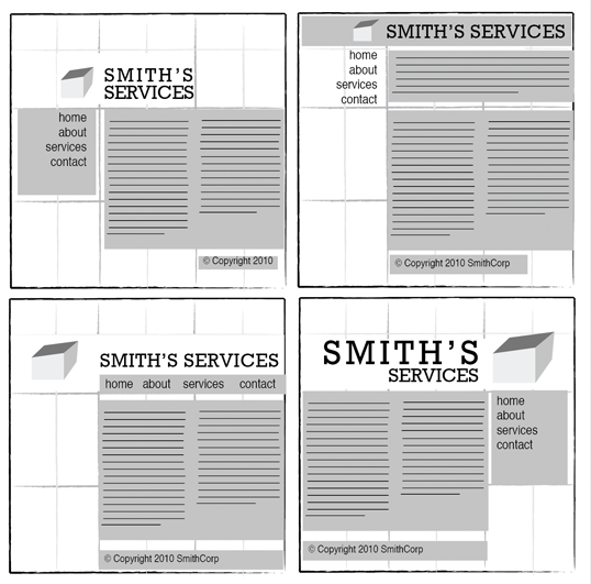
Note the use of grid theory in the following images and Web pages:


Well, I'd hoped to incorporate it in this presentation, but I'm not sure how successful I am at this sort of thing just yet. Hopefully I will have gotten a better grasp of layout and design by the time the final project is due. Now that I know what I'm going to do, it should be easy to break down the components into manageable chunks that can be plunked into a grid. At least that's the theory.