 High Resolution Version
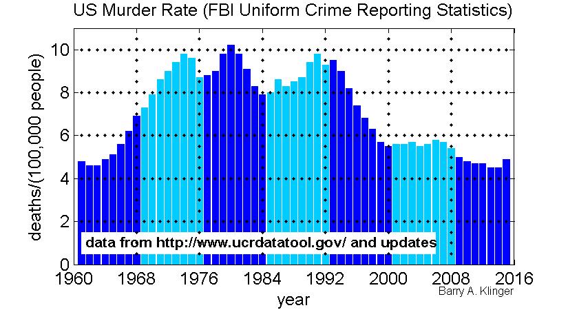
There's been talk of a US crime wave recently and it is often surprisingly hard to find an up-to-date and high quality plot of murder rate, which is the most reliable crime statistic. So I decided it was easier to make my own from FBI data. The FBI included the Oklahoma city bombing but not the 9/11 attack.
Plot shows the big crime wave of the 70s and 80s and the small decline from Bush to Obama administrations. FBI should give official 2015 figure in fall of 2016. I got 2013, 2014 data from separate FBI web pages - they didn't include the last 2 years in their database.
Plot should be legible even when shrunk, allows both year and rate to be easily read for each data point, and includes original data source.
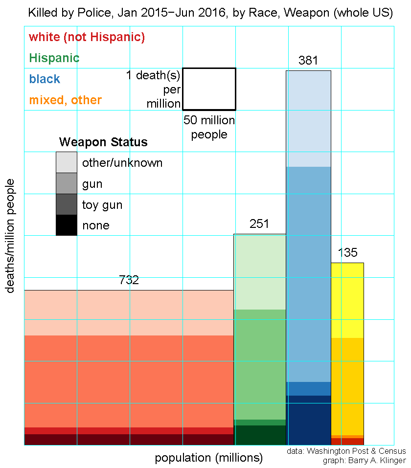
With recent outrage and counter-outrage at the deaths of African Americans at the hands of police, there have been dueling statistics on how many African Americans versus how many European Americans are killed by police. The Washington Post asks and answers the question Aren't more white people than black people killed by police? Yes, but no.
The reason for the Post's paradoxical answer is simply that the rate at which blacks are killed is higher than that for whites, but since the white population is larger, the number of whites killed is greater.
I illustrate this with the graph above. Each rectangle represents a different demographic group (color coding explained near top of graph). The width of the rectangle is proportional to the total population of that group, and the height is proportional to the rate at which members of the group are killed by police. The white rectangle near the top of the graph gives the scale of the two measurements. The area of each rectangle gives the total number of deaths, which is also printed above each rectangle. The rectangles are also subdivided based on whether the deceased was armed.
The graph clearly shows the larger number of whites killed as well as the higher rate of blacks dying. Hispanic death rates are intermediate, though closer to that of whites. In the most sensitive category of unarmed people killed by police, the discrepancy in death rate is greater than for deaths as a whole, with unarmed blacks about four times more likely to be killed than unarmed whites.
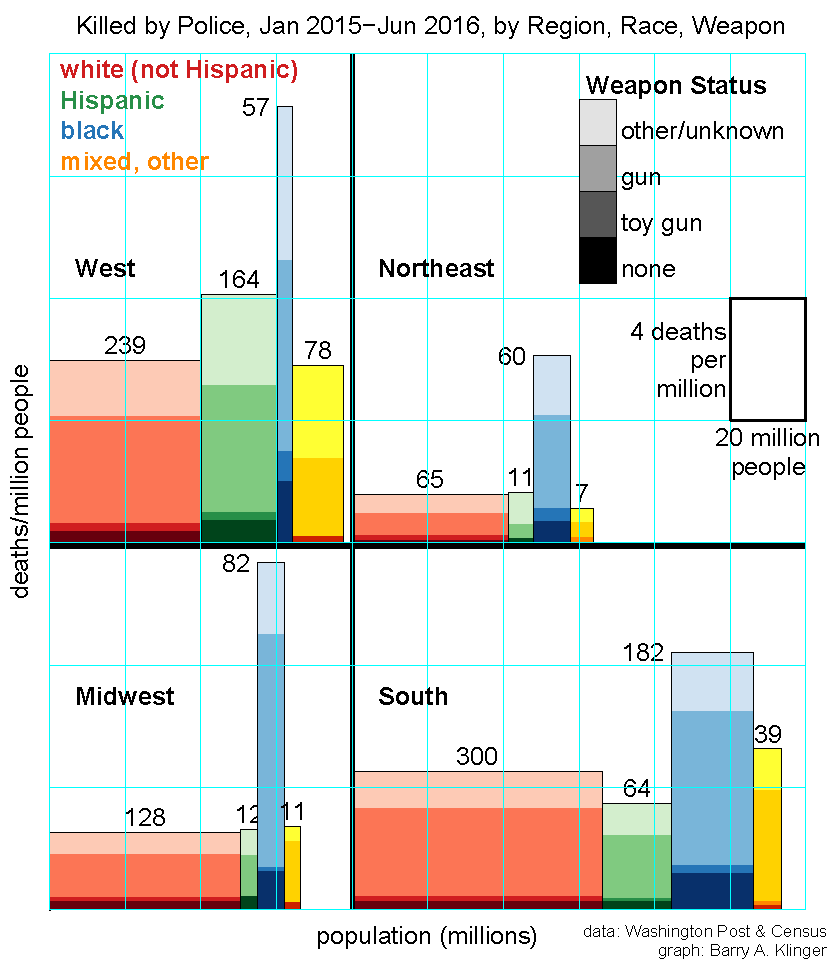
I also graph the same statistics for individual regions of the United States. The regions are identical to Census regions except that I group Maryland, Delaware, and DC with the Northeast rather than with the South. The data shows that the same basic discrepancy exists in all four regions, though the details are quite different. For instance, the Northeast has lowest death rate for each demographic group, but a similar racial disparity as the other regions. Contrary to what one might expect from regional stereotypes, the highest incidence of death-by-police is in the West.
The data is taken from a compilation of police shootings created by the Washington Post. Statistics used here are from the complete database, downloaded in July 2016 and covering January 2015 to June 2016. Thus rates of killing must be divided by 1.5 to get an annual rate. On 12 July 2016, top graph was updated to correct a typo.
I'm happy to receive feedback on this page. I can be contacted at bklinger@gmu.edu.
Back to National Economies Page
Barry A. Klinger Home Page
AOES Dept Home Page
Posted 11 July 2016
Last modified 12 August 2016