|
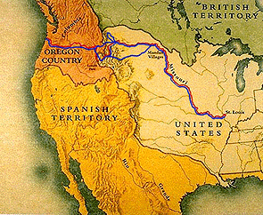
The Great Map Hunt Historical maps cry out for better clarity. Many historical maps available on the web still lack the best practices approach to digitization that seeks to optimize the use of technology and present information in a compelling manner. In the great rush to “get it up on the web,” documents of all kinds suffered abuse as we transformed them from the print format they were designed for into web formats. In a hurry to get on the digital highway, and fearful of being left behind, few people focused on what that information looked like once they got it “out there.” After the initial we’re-on-the-web euphoria wore off, sober second thoughts hit, and many folks began to wonder “what have we done?” They set about improving their sites, creating more legible text in an effort to reap the biggest payoff with the least expenditure. They fixed glaring problems with images, and iteration by iteration, documents on the web improved. Historical maps, by and large, have not yet experienced the benefits of the sober second thought as text and other graphics have. Sites predominantly continue to consider historical maps as if they were any other picture on the web. They are not. Users crave the ability to see historical maps with letter-perfect clarity on the web—never mind that the original letters are hand-written, incredibly small, or that thin lines draw important boundaries. Some sites present a map as little more than an illustration, and indeed, no ability to look closer at it is provided to the user. See for example how PBS uses a map in its site on Lewis and Clark at http://www.pbs.org/lewisandclark/inside/index.html, and to illustrate a transcript of a discussion on the Vinland map at http://www.pbs.org/newshour/bb/science/map_2-13.html. Other sites recognize that users may want greater detail. They provide links allowing the user to choose the file size they are interested in, to reveal the map either whole or in sections. Those who really are interested can click and wait for the larger files to load to their computer. Nothing comes for free, as the saying goes, and the greater detail generally is gained in a pixel-based map at the expense of increased file size and download times. See for example:
Some interactivity is possible with a plain pixel-based map. Use of the image map capacity of HTML enables creators to form clickable regions on their maps, leading to more information or pictures about that particular location. See for example a University of California-Los Angeles site on the piers of Venice and Ocean Park, CA at http://naid.sppsr.ucla.edu/venice/histmaps.html. This example is particularly well done, as it accounts for section 508 compliance, a sometimes tricky thing for image maps. In a category by themselves are the historical maps that were truly made for the web. The user gains virtually infinite zoom capacity, with no diminishment of quality. A whole new level of interactivity suddenly opens up to creators of digital maps with technologies such as JT Imaging and Macromedia Flash. More than just a “wow” factor, these maps bring new visual and cognitive experiences to the user by showing a new perspective, or integrating information in a new way. See for example how the Center for History and New Media uses JT Imaging at http://chnm.gmu.edu/features/maps/mappingtoc.html, and how National Geographic uses Macromedia Flash to present a multi-media map of the attack on Pearl Harbor at http://plasma.nationalgeographic.com/pearlharbor. As we explore the frontiers of digital history, clearer maps will enable historians to present complex information in a straight-forward and visually compelling manner. Maps have the potential to become gateways into databases, giving us new perspectives on relationships in the data. Perhaps most essential will be to match the map to the purpose. Not every map will become a sophisticated Macromedia Flash application, nor should they. However, as the necessary technology becomes more diffuse, digitally enhanced maps will become increasingly standard fare—supplanting to some extent the digital “photocopies” of maps that are now prevelant—thereby helping achieve the next iteration of history web sites.
|
|